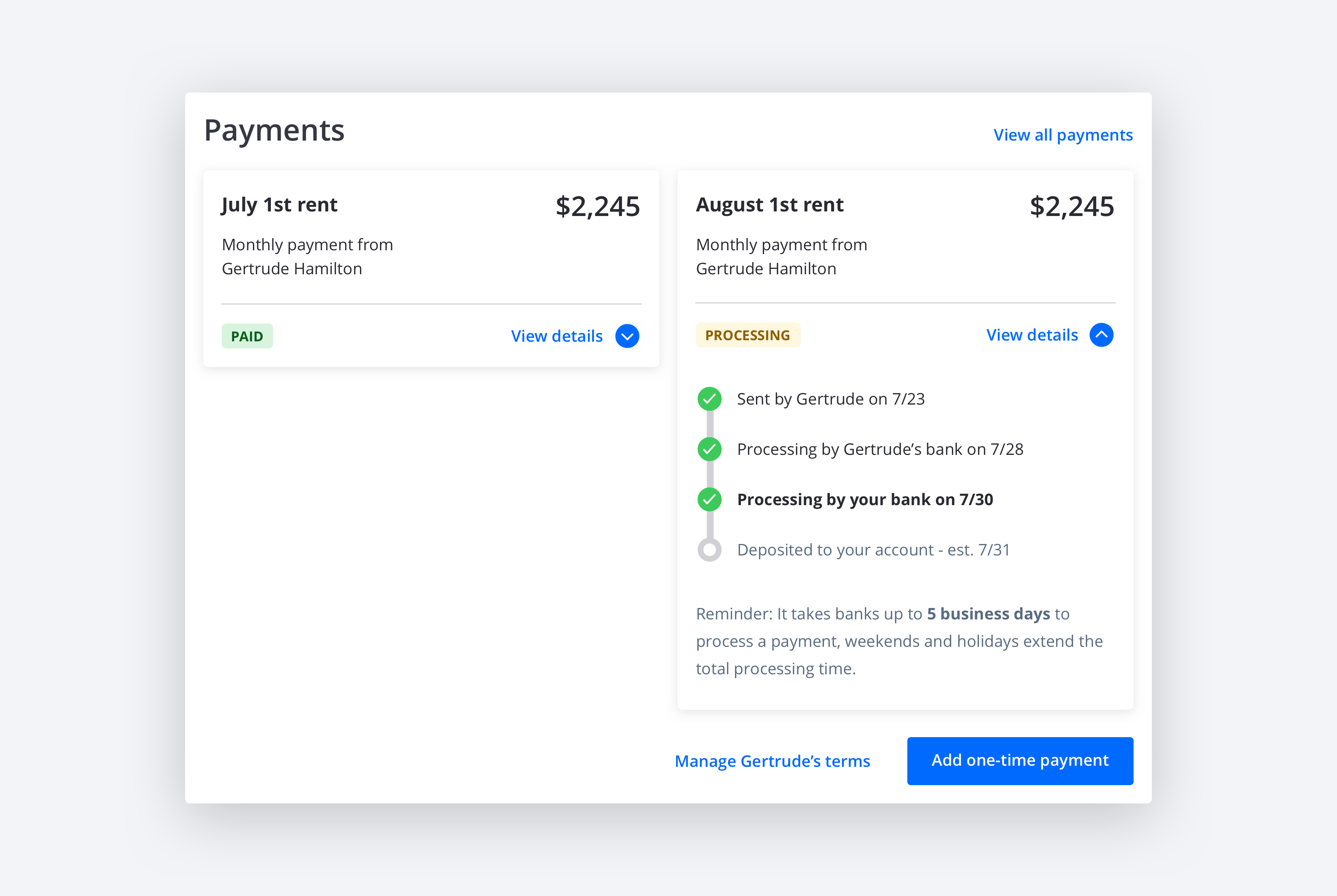
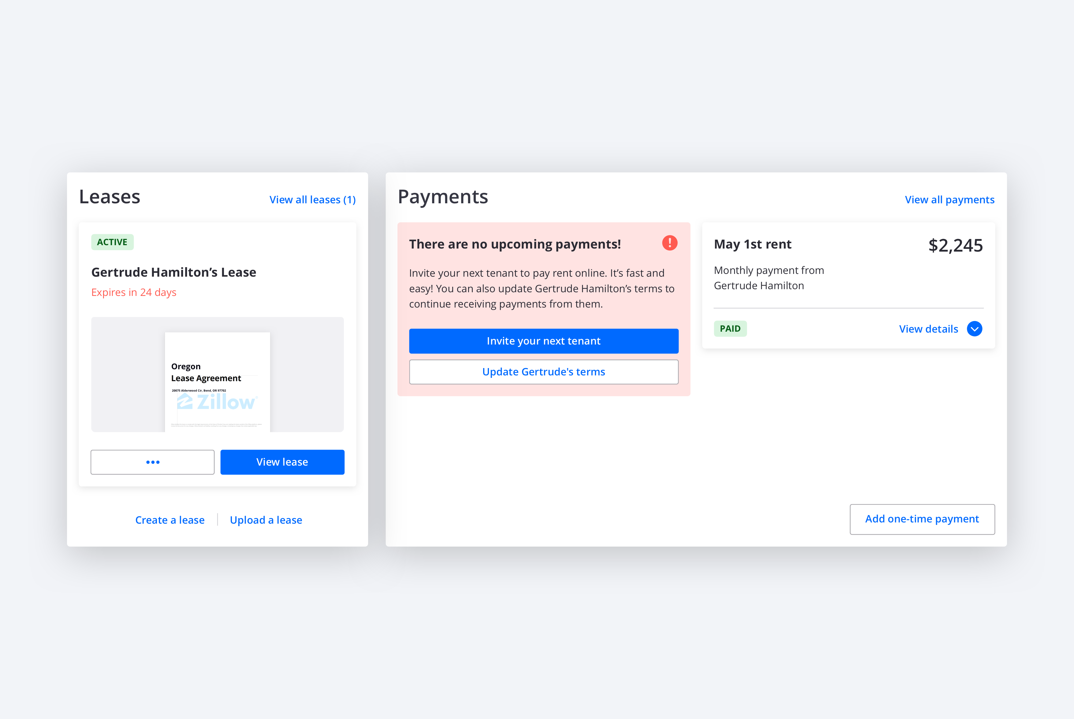
Rental Manager Redesign
Rental Manager Redesign
Rental Manager Redesign
Rental Manager Redesign
Platform redesign to fix usability problems and increase the adoption of products that live on it.
Platform redesign to fix usability problems and increase the adoption of products that live on it.
Platform redesign to fix usability problems and increase the adoption of products that live on it.
Platform redesign to fix usability problems and increase the adoption of products that live on it.
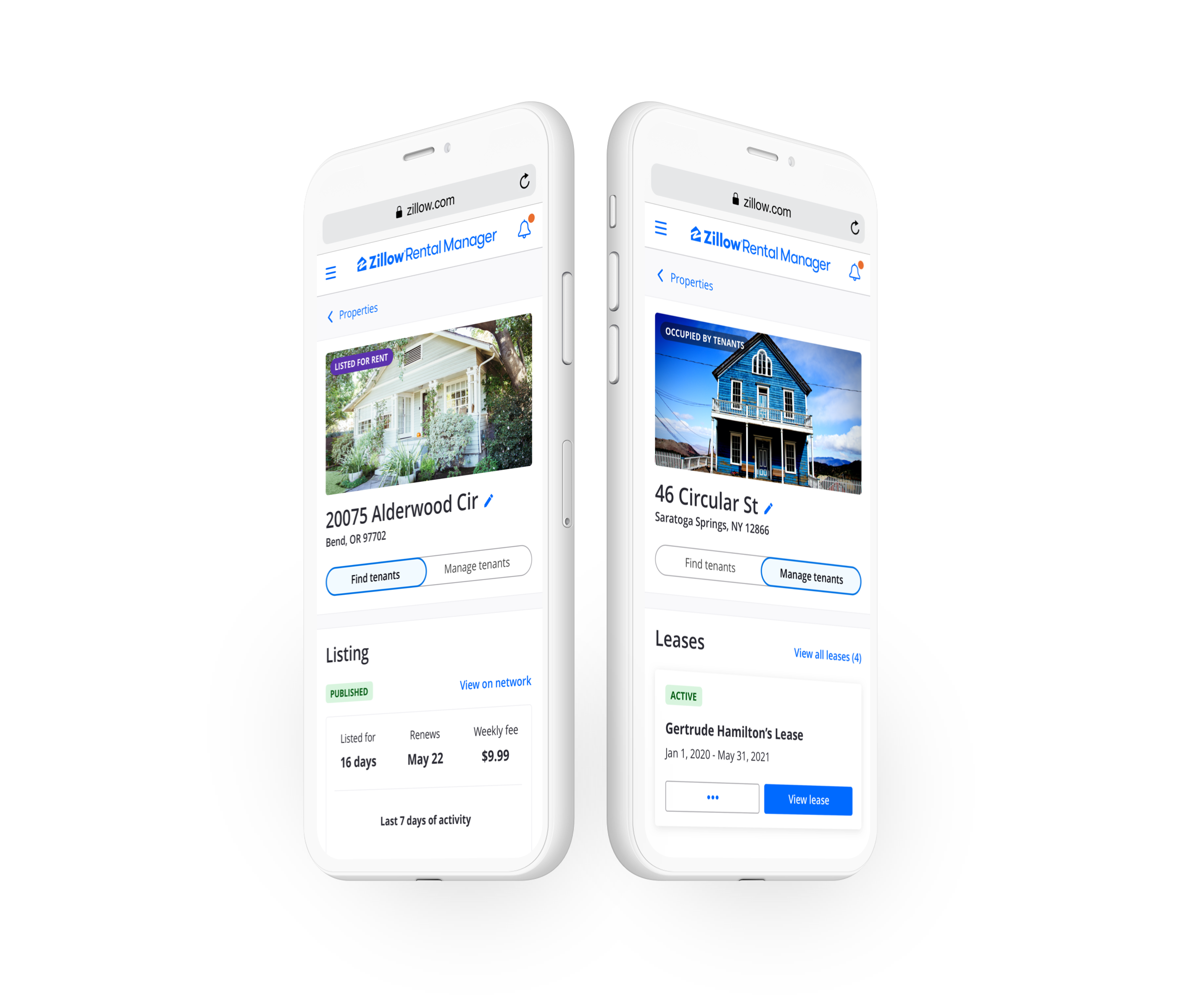
The Zillow Rental Manager platform was launched in 2017 to house the listing, applications, leases, and payments products in a one-stop shop for landlords. The platform is key to Zillow Group's rental strategy, but a constrained design process and technical limitations resulted in it launching with significant usability problems. These problems became more apparent with time and stood in the way of landlords adopting the platform's full suite of tools. It was time for a redesign.
The Zillow Rental Manager platform was launched in 2017 to house the listing, applications, leases, and payments products in a one-stop shop for landlords. The platform is key to Zillow Group's rental strategy, but a constrained design process and technical limitations resulted in it launching with significant usability problems. These problems became more apparent with time and stood in the way of landlords adopting the platform's full suite of tools. It was time for a redesign.
The Zillow Rental Manager platform was launched in 2017 to house the listing, applications, leases, and payments products in a one-stop shop for landlords. The platform is key to Zillow Group's rental strategy, but a constrained design process and technical limitations resulted in it launching with significant usability problems. These problems became more apparent with time and stood in the way of landlords adopting the platform's full suite of tools. It was time for a redesign.
The Zillow Rental Manager platform was launched in 2017 to house the listing, applications, leases, and payments products in a one-stop shop for landlords. The platform is key to Zillow Group's rental strategy, but a constrained design process and technical limitations resulted in it launching with significant usability problems. These problems became more apparent with time and stood in the way of landlords adopting the platform's full suite of tools. It was time for a redesign.
Project type
Project type
Project type
Project type
Platform redesign
Platform redesign
Platform redesign
Platform redesign
Year
Year
Year
Year
2020
2020
2020
2020
My role
My role
My role
My role
I led the effort to reenvision the platform from initial problem definition to final design deliverables. Final designs for Inbox were created by the design lead for that tool after I set the vision for it.
I led the effort to reenvision the platform from initial problem definition to final design deliverables. Final designs for Inbox were created by the design lead for that tool after I set the vision for it.
I led the effort to reenvision the platform from initial problem definition to final design deliverables. Final designs for Inbox were created by the design lead for that tool after I set the vision for it.
I led the effort to reenvision the platform from initial problem definition to final design deliverables. Final designs for Inbox were created by the design lead for that tool after I set the vision for it.
The team
The team
The team
The team
I partnered with two product managers, two development managers, and two user researchers. I consulted with design leads and product managers for the products that live on the platform.
I partnered with two product managers, two development managers, and two user researchers. I consulted with design leads and product managers for the products that live on the platform.
I partnered with two product managers, two development managers, and two user researchers. I consulted with design leads and product managers for the products that live on the platform.
I partnered with two product managers, two development managers, and two user researchers. I consulted with design leads and product managers for the products that live on the platform.
User problems
User problems
User problems
User problems
The platform's usability problems became apparent as we tested the products on it and received insights from customer support. As these insights accummulated, it became clear that the platform was not meeting users' expectations for experience outcomes that help them transition throughout the phases in their journey. We performed a Tenets and Traps analysis to fully define the usability problems and their impact on the user experience. We found that they were:
The platform's usability problems became apparent as we tested the products on it and received insights from customer support. As these insights accummulated, it became clear that the platform was not meeting users' expectations for experience outcomes that help them transition throughout the phases in their journey. We performed a Tenets and Traps analysis to fully define the usability problems and their impact on the user experience. We found that they were:
The platform's usability problems became apparent as we tested the products on it and received insights from customer support. As these insights accummulated, it became clear that the platform was not meeting users' expectations for experience outcomes that help them transition throughout the phases in their journey. We performed a Tenets and Traps analysis to fully define the usability problems and their impact on the user experience. We found that they were:
The platform's usability problems became apparent as we tested the products on it and received insights from customer support. As these insights accummulated, it became clear that the platform was not meeting users' expectations for experience outcomes that help them transition throughout the phases in their journey. We performed a Tenets and Traps analysis to fully define the usability problems and their impact on the user experience. We found that they were:
01- Memory challenge
01- Memory challenge
01- Memory challenge
01- Memory challenge
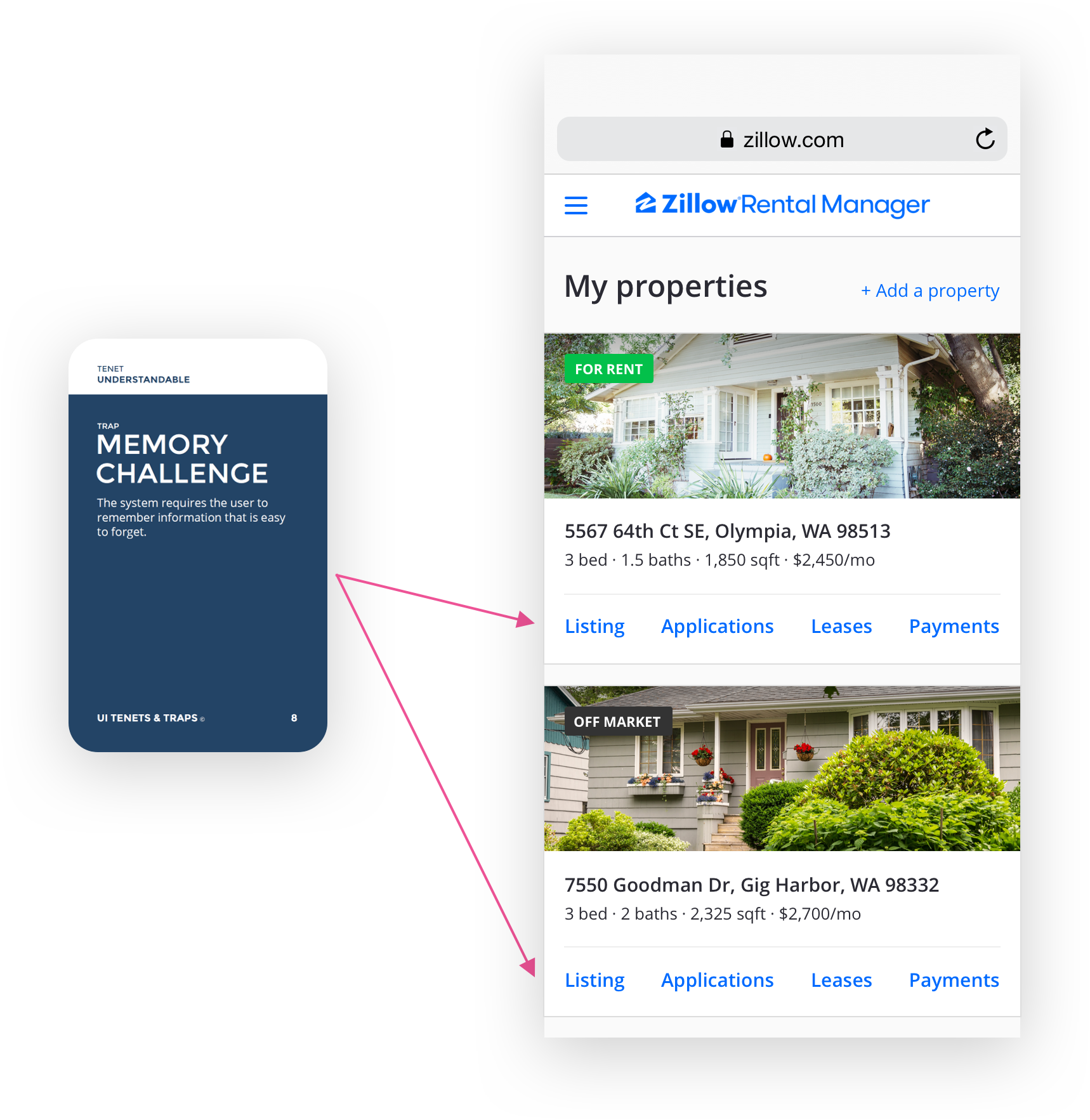
When users transition between email notifications and the platform itself, they typically land on the My Properties page before navigating to a specific property. The My Properties page serves as a hub, but offered no indication that the notification events have occurred. This makes it challenging for users to build awareness of what is new since their last visit and catch up on relevant events they may have missed. It also makes it hard for them to know what to do next to stay on track as they move from one property to the next within the same session.
When users transition between email notifications and the platform itself, they typically land on the My Properties page before navigating to a specific property. The My Properties page serves as a hub, but offered no indication that the notification events have occurred. This makes it challenging for users to build awareness of what is new since their last visit and catch up on relevant events they may have missed. It also makes it hard for them to know what to do next to stay on track as they move from one property to the next within the same session.
When users transition between email notifications and the platform itself, they typically land on the My Properties page before navigating to a specific property. The My Properties page serves as a hub, but offered no indication that the notification events have occurred. This makes it challenging for users to build awareness of what is new since their last visit and catch up on relevant events they may have missed. It also makes it hard for them to know what to do next to stay on track as they move from one property to the next within the same session.
When users transition between email notifications and the platform itself, they typically land on the My Properties page before navigating to a specific property. The My Properties page serves as a hub, but offered no indication that the notification events have occurred. This makes it challenging for users to build awareness of what is new since their last visit and catch up on relevant events they may have missed. It also makes it hard for them to know what to do next to stay on track as they move from one property to the next within the same session.
02 - Ambiguous home
02 - Ambiguous home
02 - Ambiguous home
02 - Ambiguous home
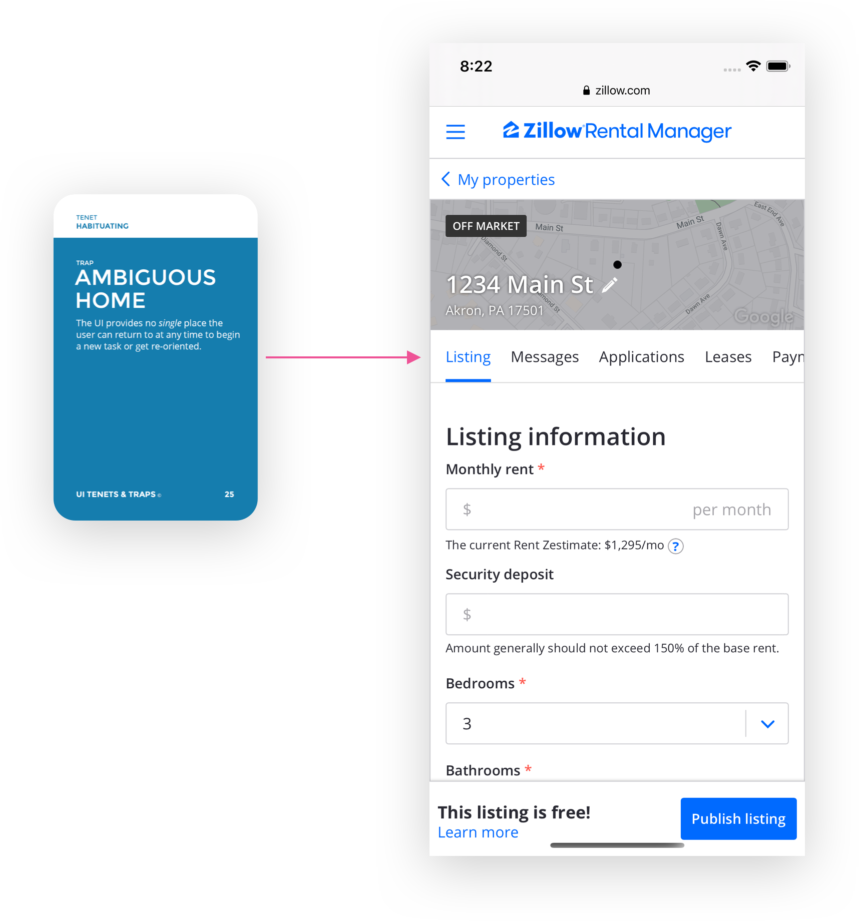
The details page for a property was structured with one tab per vertical tool (listing, messages, applications, leases, payments). This approach was great for launching and iterating on products quickly, but makes it difficult for users to form an overview of what is going on with that property as a whole. It hinders users' ability to know what is new since last visit, catch up on relevant events they may have missed, and know what to do next to stay on track in their journey with that property.
The details page for a property was structured with one tab per vertical tool (listing, messages, applications, leases, payments). This approach was great for launching and iterating on products quickly, but makes it difficult for users to form an overview of what is going on with that property as a whole. It hinders users' ability to know what is new since last visit, catch up on relevant events they may have missed, and know what to do next to stay on track in their journey with that property.
The details page for a property was structured with one tab per vertical tool (listing, messages, applications, leases, payments). This approach was great for launching and iterating on products quickly, but makes it difficult for users to form an overview of what is going on with that property as a whole. It hinders users' ability to know what is new since last visit, catch up on relevant events they may have missed, and know what to do next to stay on track in their journey with that property.
The details page for a property was structured with one tab per vertical tool (listing, messages, applications, leases, payments). This approach was great for launching and iterating on products quickly, but makes it difficult for users to form an overview of what is going on with that property as a whole. It hinders users' ability to know what is new since last visit, catch up on relevant events they may have missed, and know what to do next to stay on track in their journey with that property.
03 - Poor grouping
03 - Poor grouping
03 - Poor grouping
03 - Poor grouping
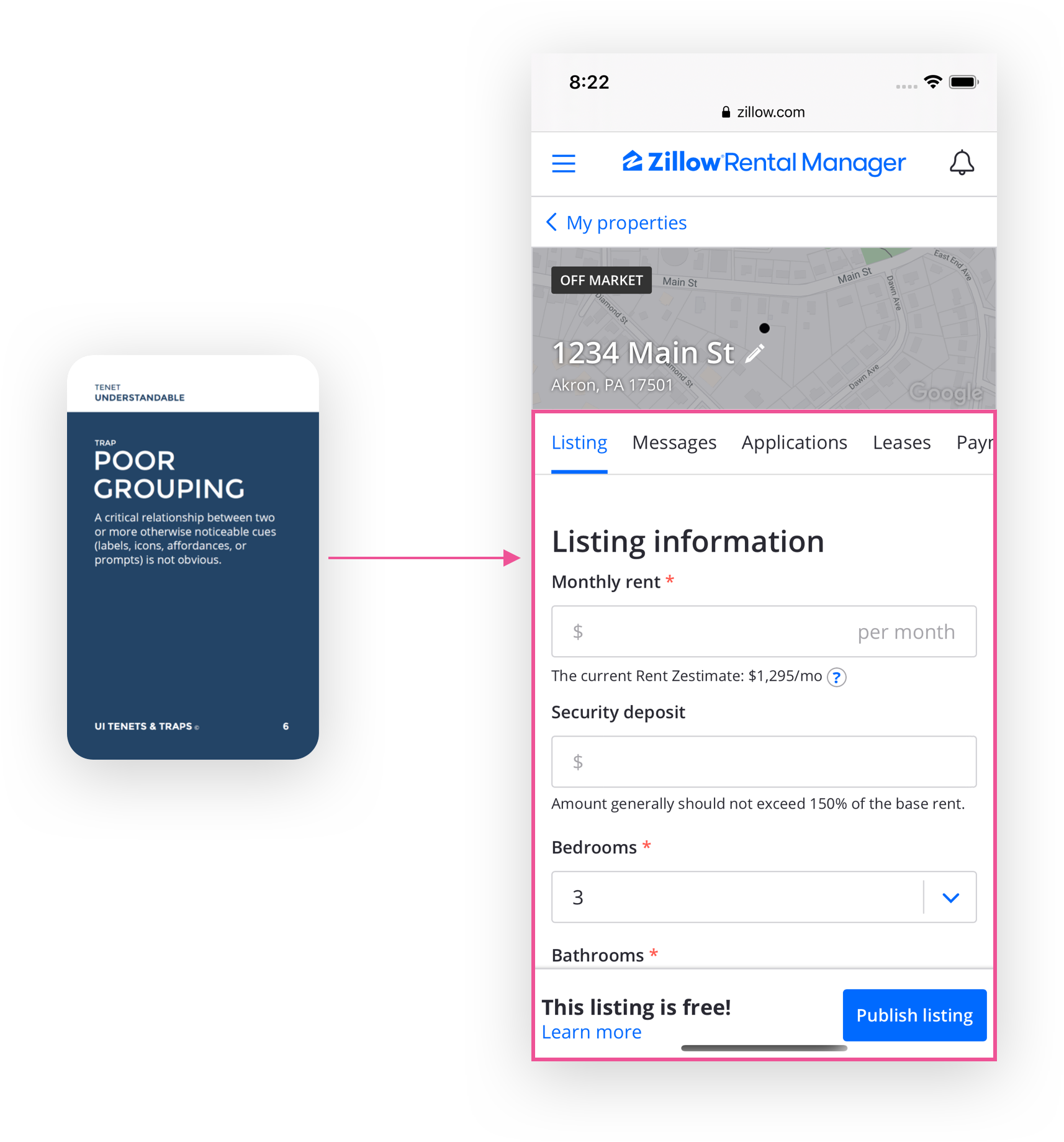
The information architecture on the property details page didn't match users' mental model of how the tools on the platform can be used together to achieve critical outcomes in their journey as landlords. While they could habituate to the poor grouping, it did hinder their discovery of products and features that could help them.
The information architecture on the property details page didn't match users' mental model of how the tools on the platform can be used together to achieve critical outcomes in their journey as landlords. While they could habituate to the poor grouping, it did hinder their discovery of products and features that could help them.
The information architecture on the property details page didn't match users' mental model of how the tools on the platform can be used together to achieve critical outcomes in their journey as landlords. While they could habituate to the poor grouping, it did hinder their discovery of products and features that could help them.
The information architecture on the property details page didn't match users' mental model of how the tools on the platform can be used together to achieve critical outcomes in their journey as landlords. While they could habituate to the poor grouping, it did hinder their discovery of products and features that could help them.
04 - System amnesia
04 - System amnesia
04 - System amnesia
04 - System amnesia
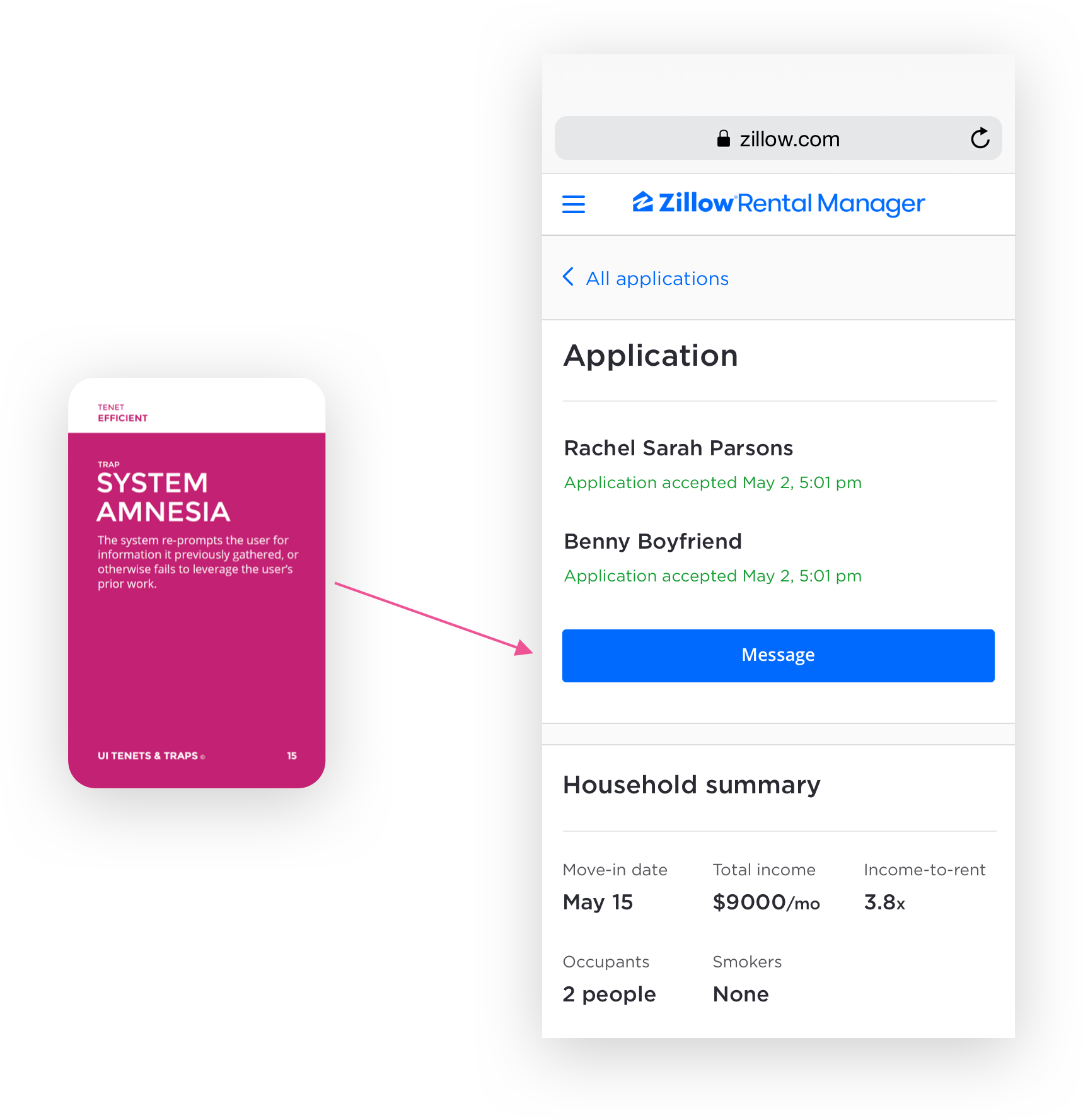
The tools on the platform cover almost the entire user journey for landlords, and each one is relevant in succession. However, the platform provides cues or guidance for when it is relevant to transition from one tool to the next. This hinders users' ability to know what to do next to stay on track toward achieving their goals. The applications tool is an example of this system amnesia. The application from Rachel and Benny has been accepted by the landlord but there are no cues or guidance to create a lease and set up rent payments, which are the next steps in the journey.
The tools on the platform cover almost the entire user journey for landlords, and each one is relevant in succession. However, the platform provides cues or guidance for when it is relevant to transition from one tool to the next. This hinders users' ability to know what to do next to stay on track toward achieving their goals. The applications tool is an example of this system amnesia. The application from Rachel and Benny has been accepted by the landlord but there are no cues or guidance to create a lease and set up rent payments, which are the next steps in the journey.
The tools on the platform cover almost the entire user journey for landlords, and each one is relevant in succession. However, the platform provides cues or guidance for when it is relevant to transition from one tool to the next. This hinders users' ability to know what to do next to stay on track toward achieving their goals. The applications tool is an example of this system amnesia. The application from Rachel and Benny has been accepted by the landlord but there are no cues or guidance to create a lease and set up rent payments, which are the next steps in the journey.
The tools on the platform cover almost the entire user journey for landlords, and each one is relevant in succession. However, the platform provides cues or guidance for when it is relevant to transition from one tool to the next. This hinders users' ability to know what to do next to stay on track toward achieving their goals. The applications tool is an example of this system amnesia. The application from Rachel and Benny has been accepted by the landlord but there are no cues or guidance to create a lease and set up rent payments, which are the next steps in the journey.
05 - Unnecessary steps
05 - Unnecessary steps
05 - Unnecessary steps
05 - Unnecessary steps
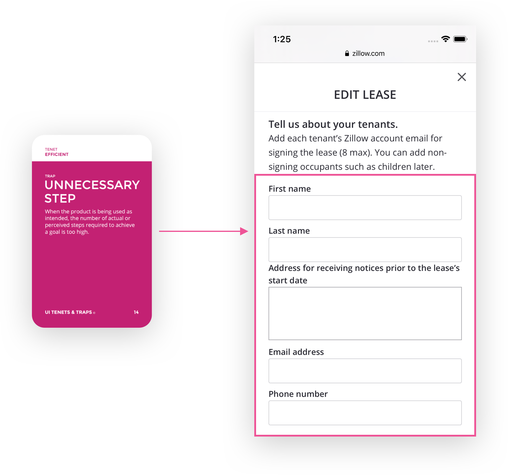
The lack of data sharing across the platform tools forced users to re-enter information when they transitioned between the tools. The leases tool is shown here is an example. The rental applications tool already contained much of the tenant information that is relevant when creating a lease, but users were forced to re-enter this information manually. This isn't a severe usability problem, but it is annoying to users and erodes their trust in the platform.
The lack of data sharing across the platform tools forced users to re-enter information when they transitioned between the tools. The leases tool is shown here is an example. The rental applications tool already contained much of the tenant information that is relevant when creating a lease, but users were forced to re-enter this information manually. This isn't a severe usability problem, but it is annoying to users and erodes their trust in the platform.
The lack of data sharing across the platform tools forced users to re-enter information when they transitioned between the tools. The leases tool is shown here is an example. The rental applications tool already contained much of the tenant information that is relevant when creating a lease, but users were forced to re-enter this information manually. This isn't a severe usability problem, but it is annoying to users and erodes their trust in the platform.
The lack of data sharing across the platform tools forced users to re-enter information when they transitioned between the tools. The leases tool is shown here is an example. The rental applications tool already contained much of the tenant information that is relevant when creating a lease, but users were forced to re-enter this information manually. This isn't a severe usability problem, but it is annoying to users and erodes their trust in the platform.
Crafting the solution
Crafting the solution
Crafting the solution
Crafting the solution
We had sufficient foundational research about landlords and how the platform is used throughout their journey. A product manager partner and I compiled an overview of platform events that we could use as signals for knowing where in their journey a user is. I also collaborated with the lead designer for a parallel initiative for renters to ensure we were in sync on when and how renters and landlords interact throughout their respective user journeys. Both efforts prepared me for early paper prototyping.
We had sufficient foundational research about landlords and how the platform is used throughout their journey. A product manager partner and I compiled an overview of platform events that we could use as signals for knowing where in their journey a user is. I also collaborated with the lead designer for a parallel initiative for renters to ensure we were in sync on when and how renters and landlords interact throughout their respective user journeys. Both efforts prepared me for early paper prototyping.
We had sufficient foundational research about landlords and how the platform is used throughout their journey. A product manager partner and I compiled an overview of platform events that we could use as signals for knowing where in their journey a user is. I also collaborated with the lead designer for a parallel initiative for renters to ensure we were in sync on when and how renters and landlords interact throughout their respective user journeys. Both efforts prepared me for early paper prototyping.
We had sufficient foundational research about landlords and how the platform is used throughout their journey. A product manager partner and I compiled an overview of platform events that we could use as signals for knowing where in their journey a user is. I also collaborated with the lead designer for a parallel initiative for renters to ensure we were in sync on when and how renters and landlords interact throughout their respective user journeys. Both efforts prepared me for early paper prototyping.
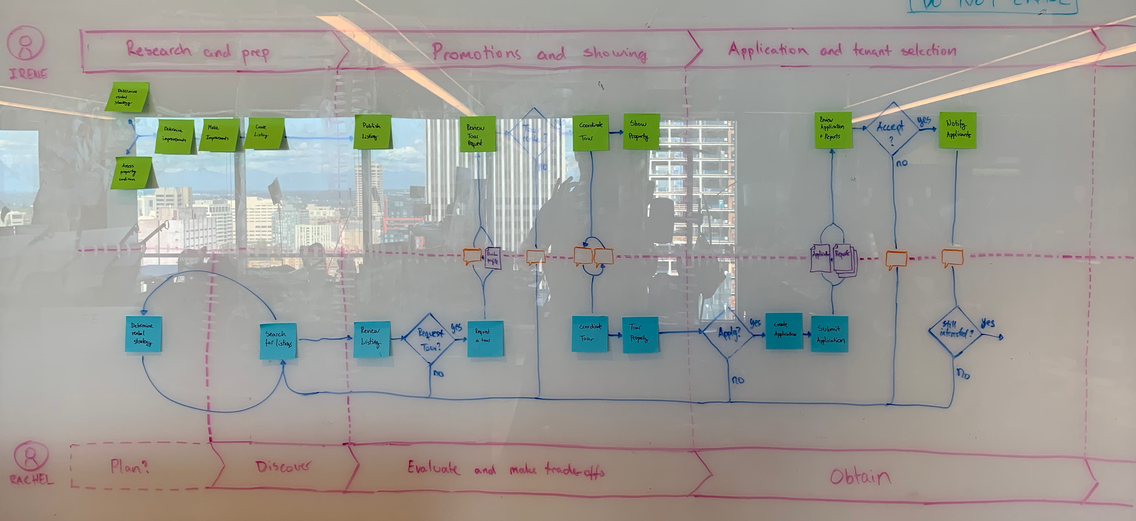
A user flow of how renters and landlords interact in the earlier phases of their journeys.
Paper prototyping
Paper prototyping
Paper prototyping
Paper prototyping
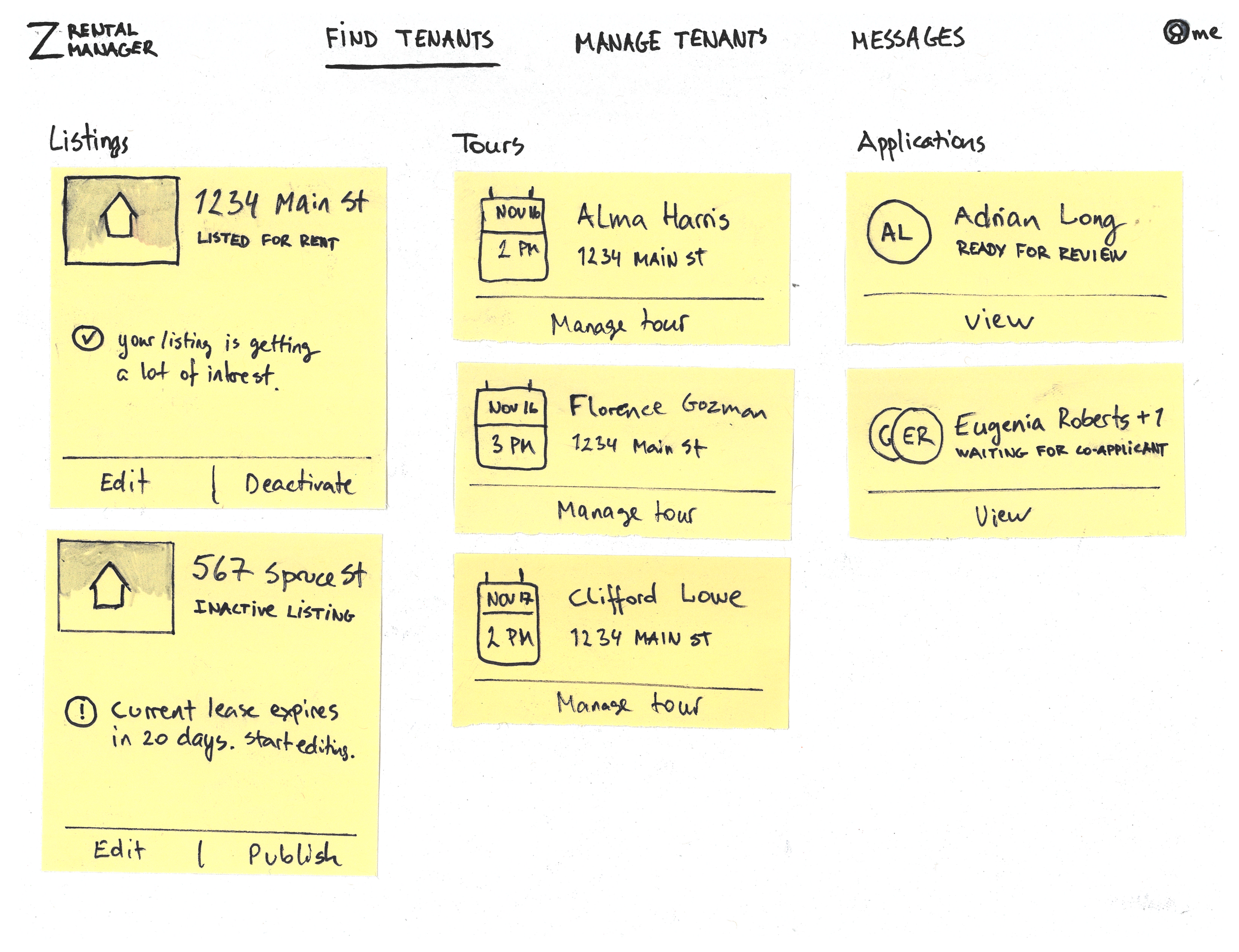
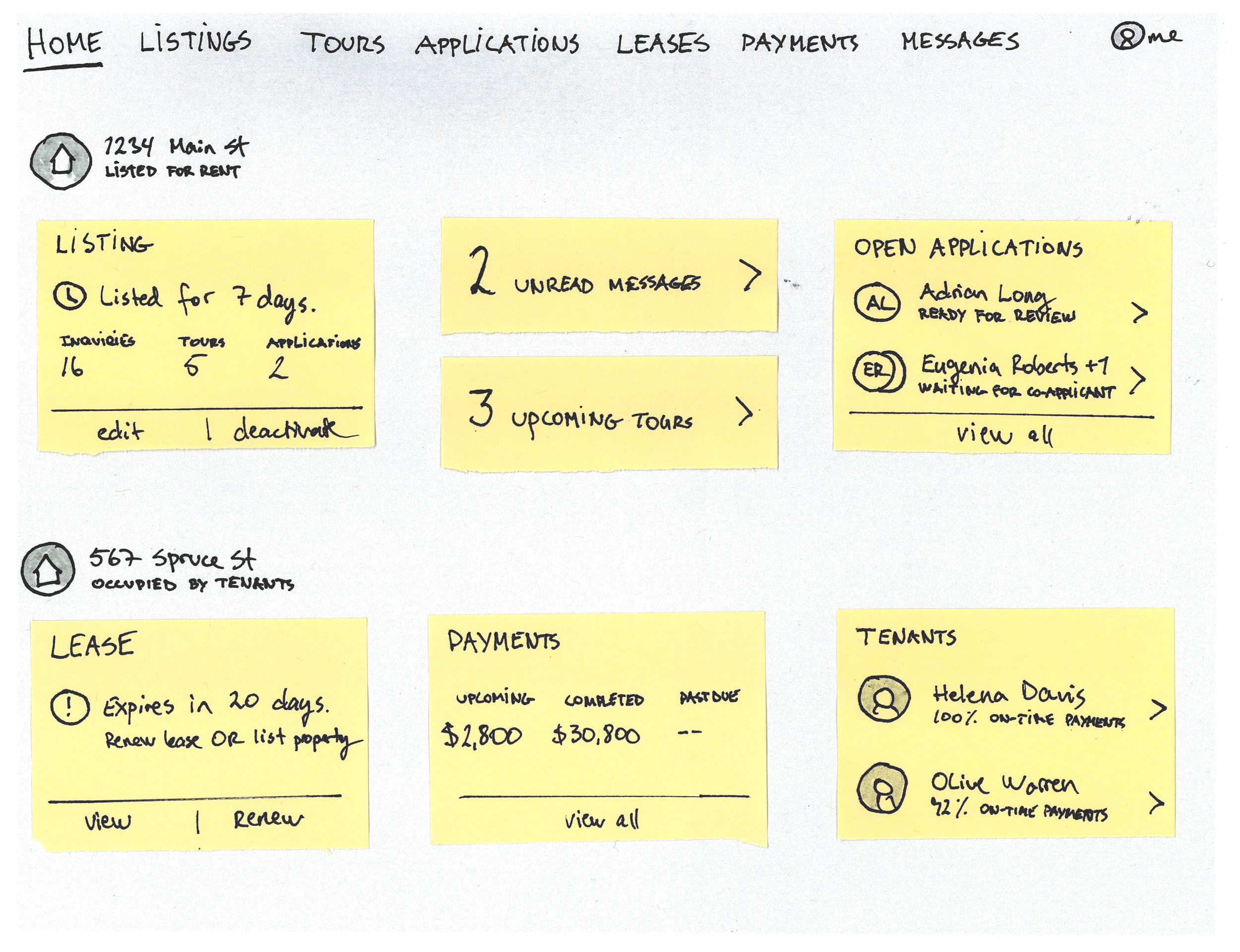
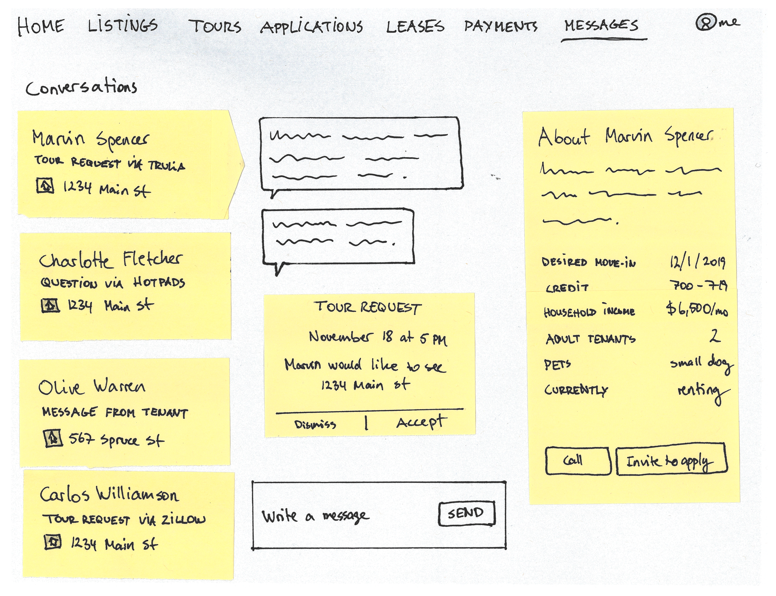
The Zillow Rental Manager platform was inherently property-centric. I wanted to explore other options before our co-creation workshop with landlords. The lead designer for the parrallel initiatives for renters and I did a comparative analysis to help identify what other options to explore. I explored a task-centric model as well as a tool-centric model. I did the explorations on paper since I was going to put them in front of landlords for feedback. Paper prototyping is great for soliciting the kind of feedback we were looking for.
The Zillow Rental Manager platform was inherently property-centric. I wanted to explore other options before our co-creation workshop with landlords. The lead designer for the parrallel initiatives for renters and I did a comparative analysis to help identify what other options to explore. I explored a task-centric model as well as a tool-centric model. I did the explorations on paper since I was going to put them in front of landlords for feedback. Paper prototyping is great for soliciting the kind of feedback we were looking for.
The Zillow Rental Manager platform was inherently property-centric. I wanted to explore other options before our co-creation workshop with landlords. The lead designer for the parrallel initiatives for renters and I did a comparative analysis to help identify what other options to explore. I explored a task-centric model as well as a tool-centric model. I did the explorations on paper since I was going to put them in front of landlords for feedback. Paper prototyping is great for soliciting the kind of feedback we were looking for.
The Zillow Rental Manager platform was inherently property-centric. I wanted to explore other options before our co-creation workshop with landlords. The lead designer for the parrallel initiatives for renters and I did a comparative analysis to help identify what other options to explore. I explored a task-centric model as well as a tool-centric model. I did the explorations on paper since I was going to put them in front of landlords for feedback. Paper prototyping is great for soliciting the kind of feedback we were looking for.
Co-creation workshop
Co-creation workshop
Co-creation workshop
Co-creation workshop
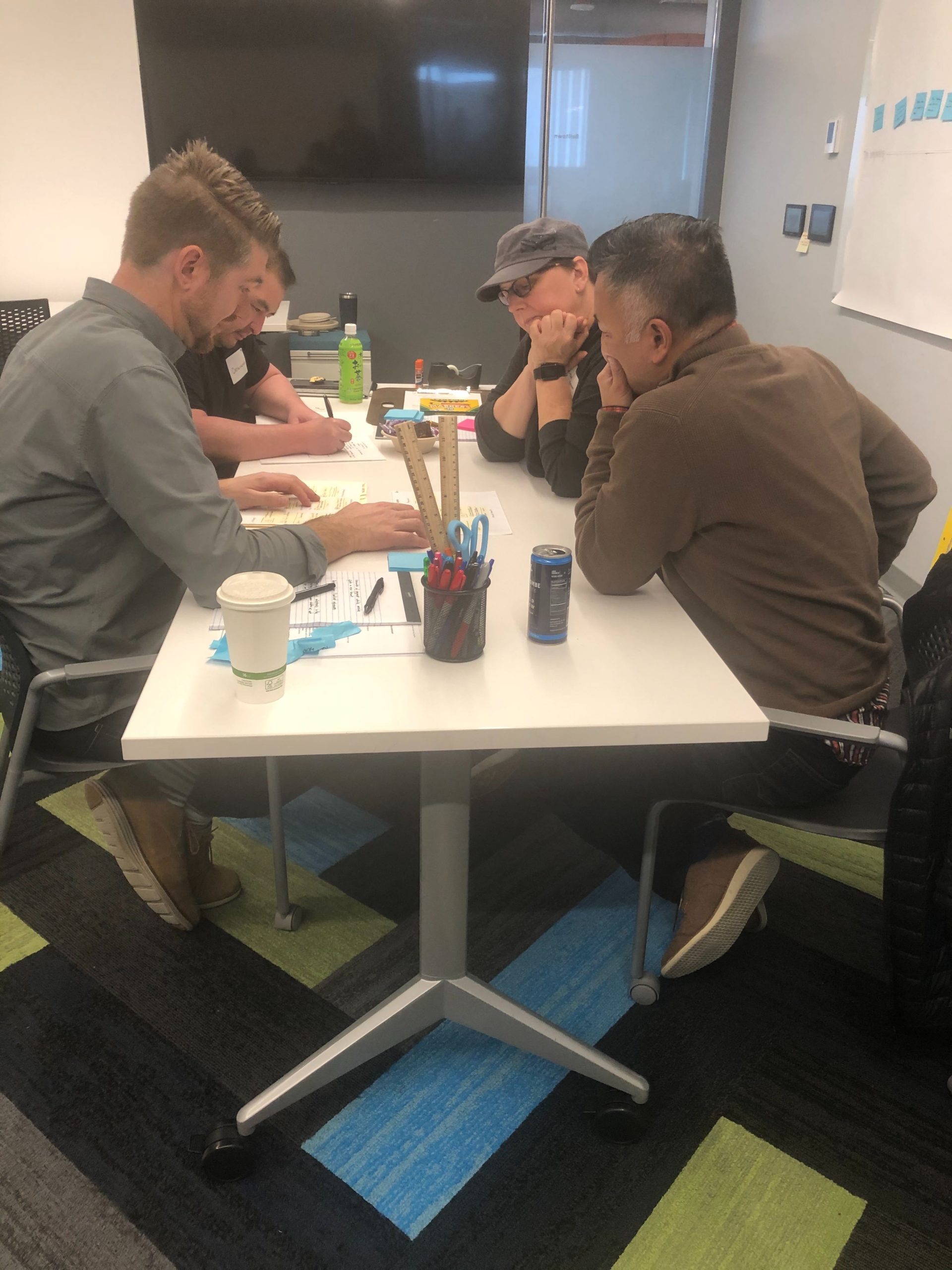
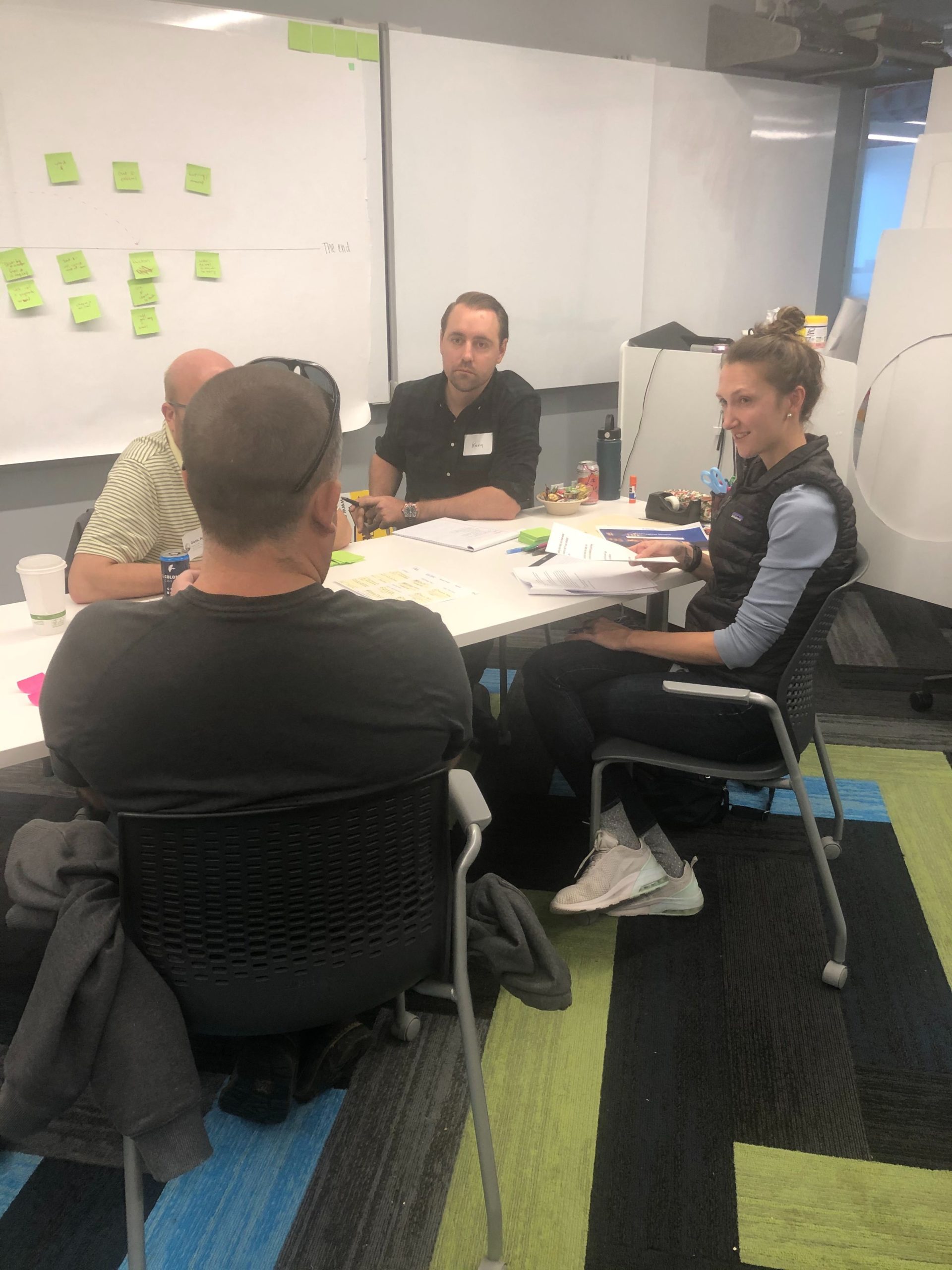
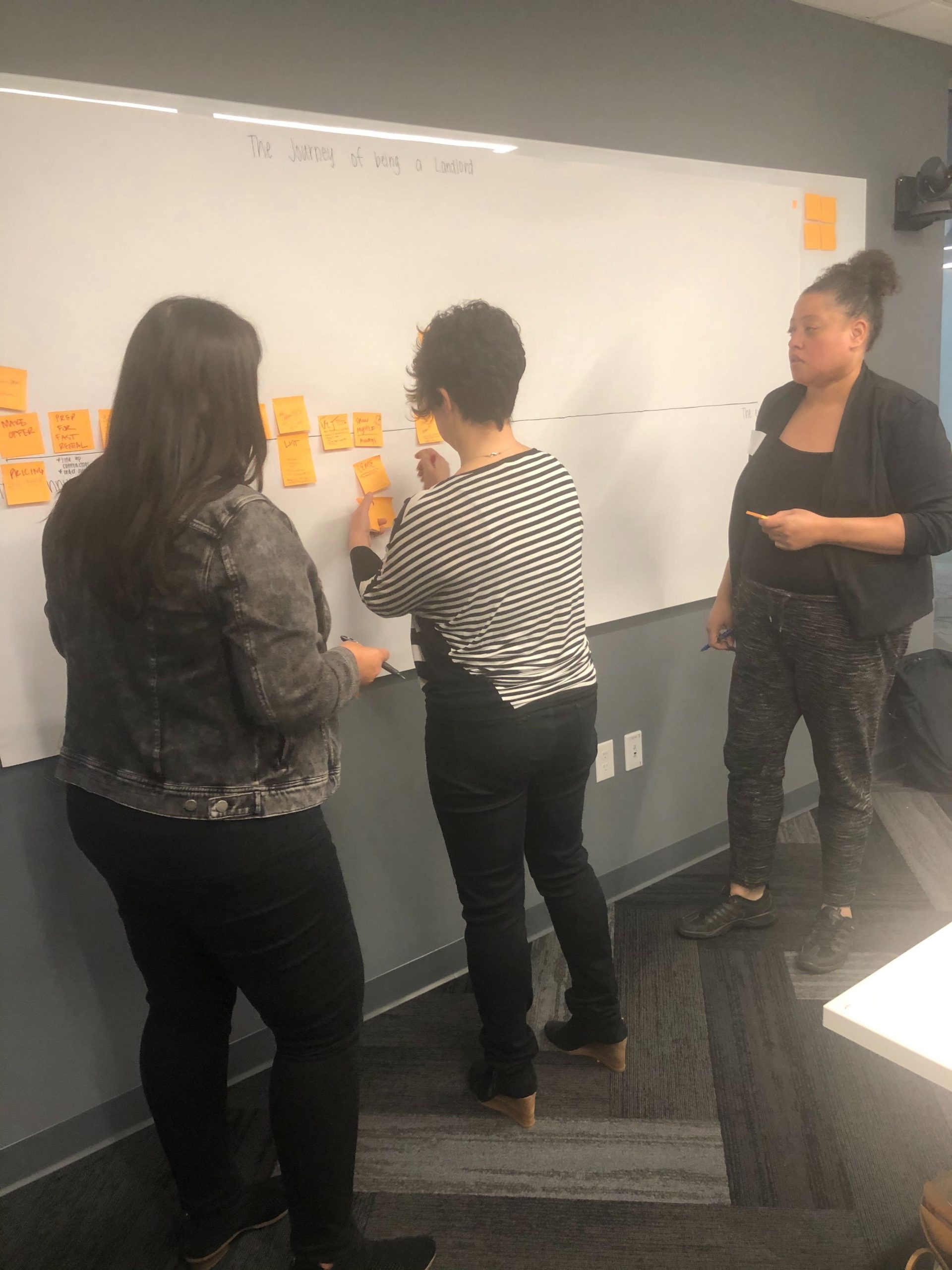
The goal of the co-creation workshop was to solicit input from landlords on how they would like a one-stop shop platform to be structured. We invited landlords onsite and divided them into three groups. We interviewed them about their experiences, then got their feedback on the paper prototypes, and finally evolved the prototype concepts together. Among other things, we learned that the tool-centric and task-centric concepts should be combined into one that expanded upon useful elements from both.
The goal of the co-creation workshop was to solicit input from landlords on how they would like a one-stop shop platform to be structured. We invited landlords onsite and divided them into three groups. We interviewed them about their experiences, then got their feedback on the paper prototypes, and finally evolved the prototype concepts together. Among other things, we learned that the tool-centric and task-centric concepts should be combined into one that expanded upon useful elements from both.
The goal of the co-creation workshop was to solicit input from landlords on how they would like a one-stop shop platform to be structured. We invited landlords onsite and divided them into three groups. We interviewed them about their experiences, then got their feedback on the paper prototypes, and finally evolved the prototype concepts together. Among other things, we learned that the tool-centric and task-centric concepts should be combined into one that expanded upon useful elements from both.
The goal of the co-creation workshop was to solicit input from landlords on how they would like a one-stop shop platform to be structured. We invited landlords onsite and divided them into three groups. We interviewed them about their experiences, then got their feedback on the paper prototypes, and finally evolved the prototype concepts together. Among other things, we learned that the tool-centric and task-centric concepts should be combined into one that expanded upon useful elements from both.
Concept testing
Concept testing
Concept testing
Concept testing
I created a new platform concept based on the learnings from the co-creation workshop. This became the starting point for two rounds of concept testing that followed. The first round was conducted as a Rapid Iterative Testing and Evaluation (RITE) study where I iterated on the concept among participants. This allowed us to quickly try new concepts and clarify aspects that the previous participant found challenging. We learned that a stronger grouping of objects in the information architecture was needed. I evolved the concept further for the next round of concept testing. The second round of concept testing was conducted as a moderated, generative usability study. We learned that the grouping of objects by property and by tenants worked well for landlords. They naturally associated the labels I used with the objects they represented. I also experimented with a task pane, which was received with mixed feedback, as was a dashboard that summarizes rent payments across several properties.
I created a new platform concept based on the learnings from the co-creation workshop. This became the starting point for two rounds of concept testing that followed. The first round was conducted as a Rapid Iterative Testing and Evaluation (RITE) study where I iterated on the concept among participants. This allowed us to quickly try new concepts and clarify aspects that the previous participant found challenging. We learned that a stronger grouping of objects in the information architecture was needed. I evolved the concept further for the next round of concept testing. The second round of concept testing was conducted as a moderated, generative usability study. We learned that the grouping of objects by property and by tenants worked well for landlords. They naturally associated the labels I used with the objects they represented. I also experimented with a task pane, which was received with mixed feedback, as was a dashboard that summarizes rent payments across several properties.
I created a new platform concept based on the learnings from the co-creation workshop. This became the starting point for two rounds of concept testing that followed. The first round was conducted as a Rapid Iterative Testing and Evaluation (RITE) study where I iterated on the concept among participants. This allowed us to quickly try new concepts and clarify aspects that the previous participant found challenging. We learned that a stronger grouping of objects in the information architecture was needed. I evolved the concept further for the next round of concept testing. The second round of concept testing was conducted as a moderated, generative usability study. We learned that the grouping of objects by property and by tenants worked well for landlords. They naturally associated the labels I used with the objects they represented. I also experimented with a task pane, which was received with mixed feedback, as was a dashboard that summarizes rent payments across several properties.
I created a new platform concept based on the learnings from the co-creation workshop. This became the starting point for two rounds of concept testing that followed. The first round was conducted as a Rapid Iterative Testing and Evaluation (RITE) study where I iterated on the concept among participants. This allowed us to quickly try new concepts and clarify aspects that the previous participant found challenging. We learned that a stronger grouping of objects in the information architecture was needed. I evolved the concept further for the next round of concept testing. The second round of concept testing was conducted as a moderated, generative usability study. We learned that the grouping of objects by property and by tenants worked well for landlords. They naturally associated the labels I used with the objects they represented. I also experimented with a task pane, which was received with mixed feedback, as was a dashboard that summarizes rent payments across several properties.
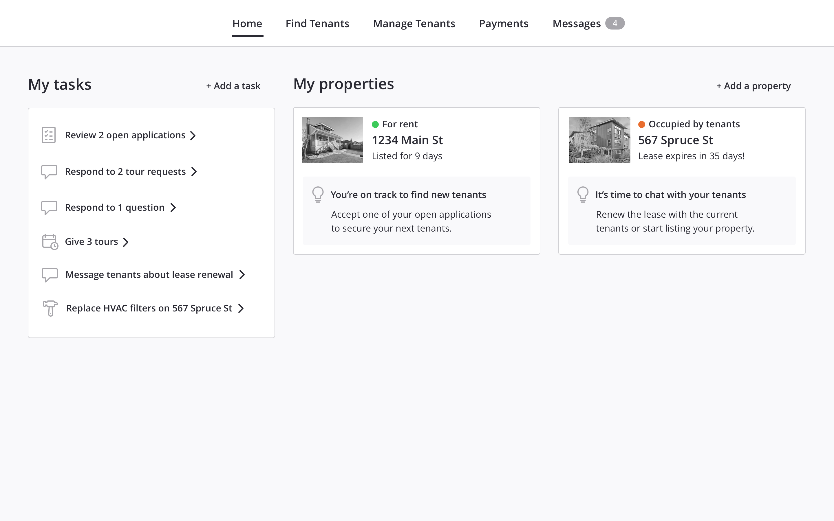
A screen from the prototype used in the RITE study.
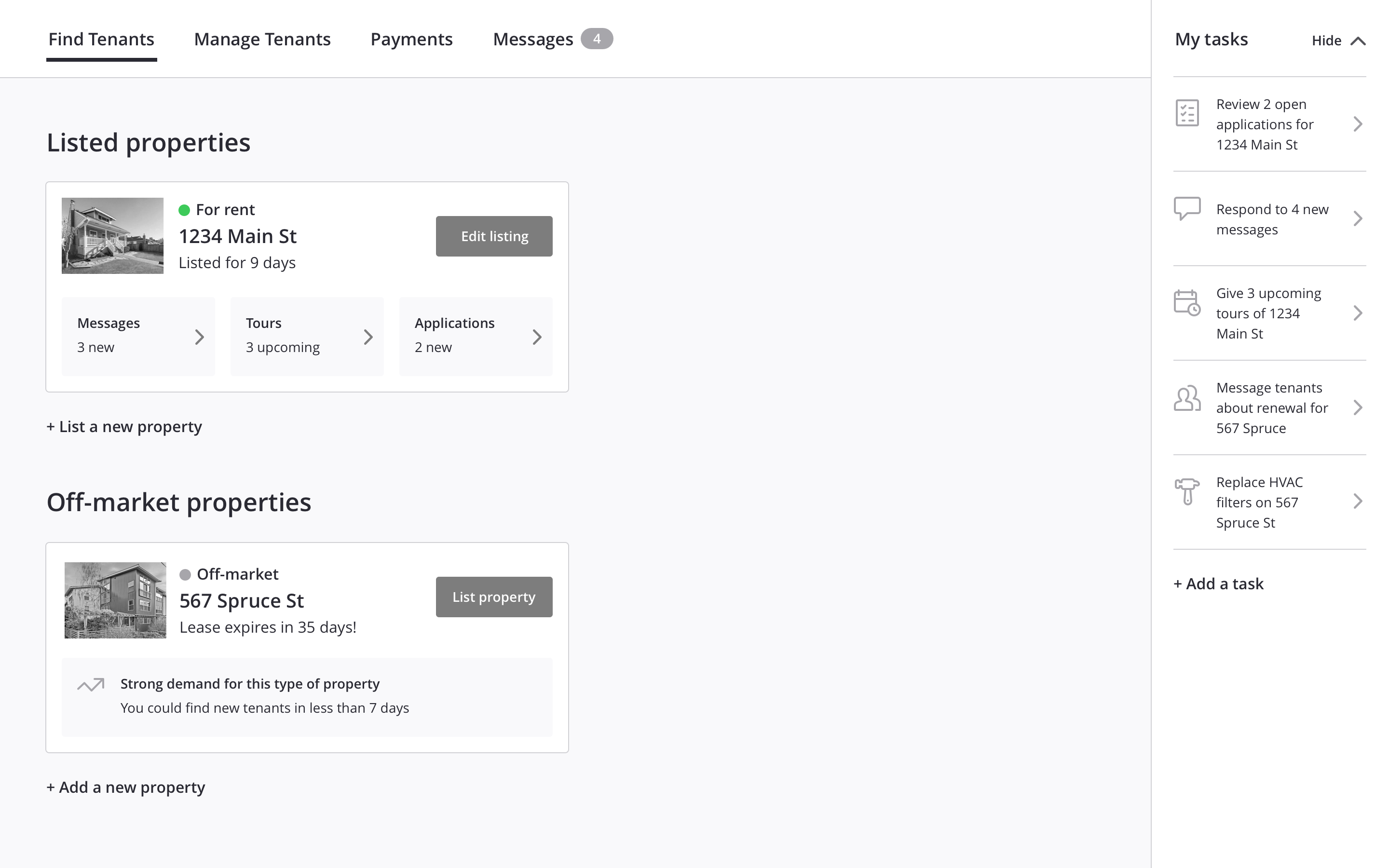
A screen from the prototype used in the generative usability study.
Tree testing
Tree testing
Tree testing
Tree testing
By now, we had a honed concept for how the platform should be organized, but one key aspect kept getting challenged in design reviews. Stakeholders were skeptical about leases and payments being organized by tenants and located under the label “Manage Tenants”. We ran a tree test study to validate our previous findings with a larger number of participants. For even more perspective, we tried four options that contained variations in information architecture and labelling.
By now, we had a honed concept for how the platform should be organized, but one key aspect kept getting challenged in design reviews. Stakeholders were skeptical about leases and payments being organized by tenants and located under the label “Manage Tenants”. We ran a tree test study to validate our previous findings with a larger number of participants. For even more perspective, we tried four options that contained variations in information architecture and labelling.
By now, we had a honed concept for how the platform should be organized, but one key aspect kept getting challenged in design reviews. Stakeholders were skeptical about leases and payments being organized by tenants and located under the label “Manage Tenants”. We ran a tree test study to validate our previous findings with a larger number of participants. For even more perspective, we tried four options that contained variations in information architecture and labelling.
By now, we had a honed concept for how the platform should be organized, but one key aspect kept getting challenged in design reviews. Stakeholders were skeptical about leases and payments being organized by tenants and located under the label “Manage Tenants”. We ran a tree test study to validate our previous findings with a larger number of participants. For even more perspective, we tried four options that contained variations in information architecture and labelling.
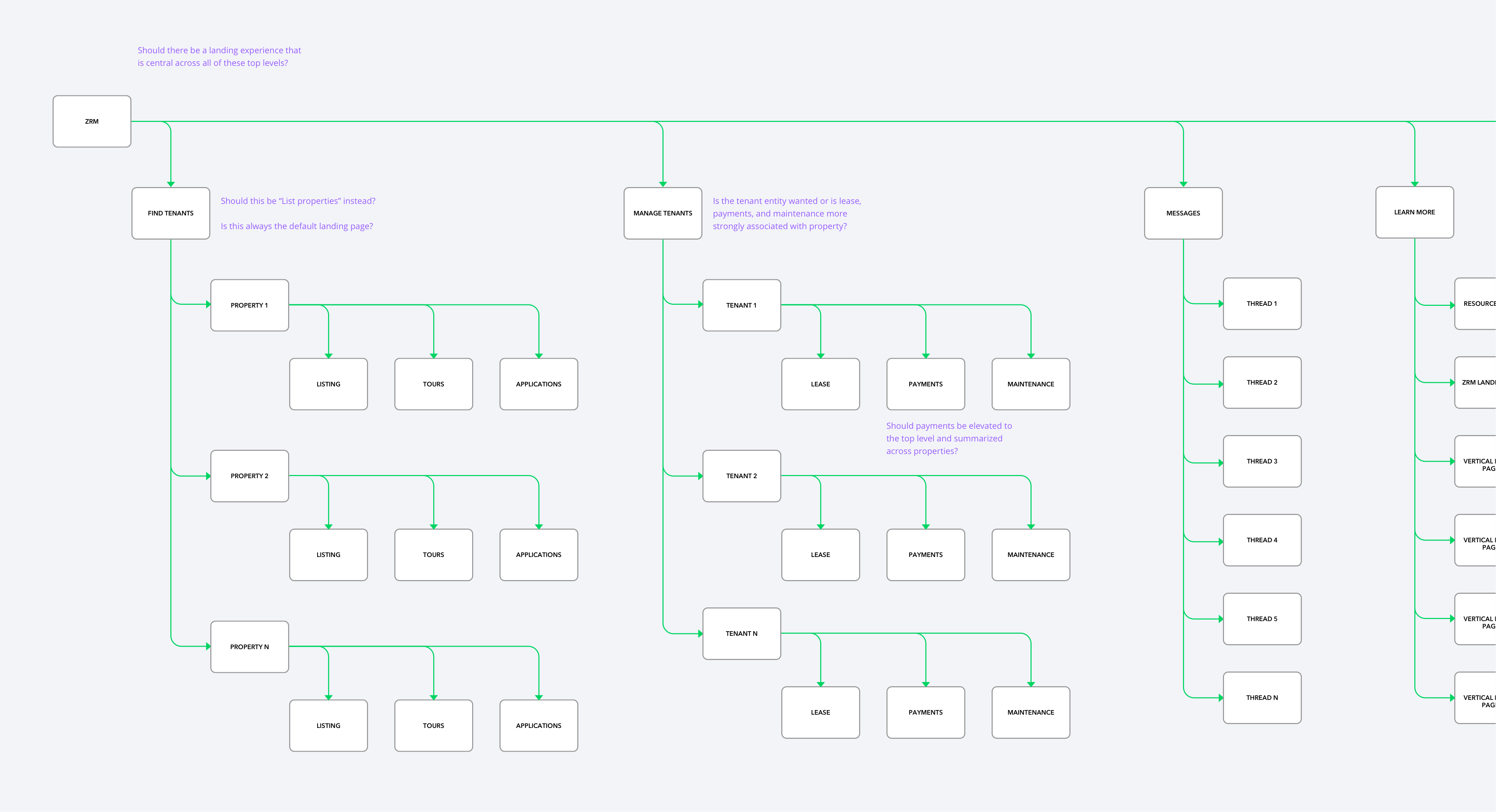
IA diagram of one of the four options we used in the tree testing.
There was no "winning" IA but we learned several things. Landlords' mental model for grouping objects is inherently property-centric. The "Find Tenants" and "Manage Tenants" labels clearly resonate with them but whenever they are to complete a task, they seek to start by selecting a property. This key lesson made me adjust the information architecture.
There was no "winning" IA but we learned several things. Landlords' mental model for grouping objects is inherently property-centric. The "Find Tenants" and "Manage Tenants" labels clearly resonate with them but whenever they are to complete a task, they seek to start by selecting a property. This key lesson made me adjust the information architecture.
There was no "winning" IA but we learned several things. Landlords' mental model for grouping objects is inherently property-centric. The "Find Tenants" and "Manage Tenants" labels clearly resonate with them but whenever they are to complete a task, they seek to start by selecting a property. This key lesson made me adjust the information architecture.
There was no "winning" IA but we learned several things. Landlords' mental model for grouping objects is inherently property-centric. The "Find Tenants" and "Manage Tenants" labels clearly resonate with them but whenever they are to complete a task, they seek to start by selecting a property. This key lesson made me adjust the information architecture.
Design sprint
Design sprint
Design sprint
Design sprint
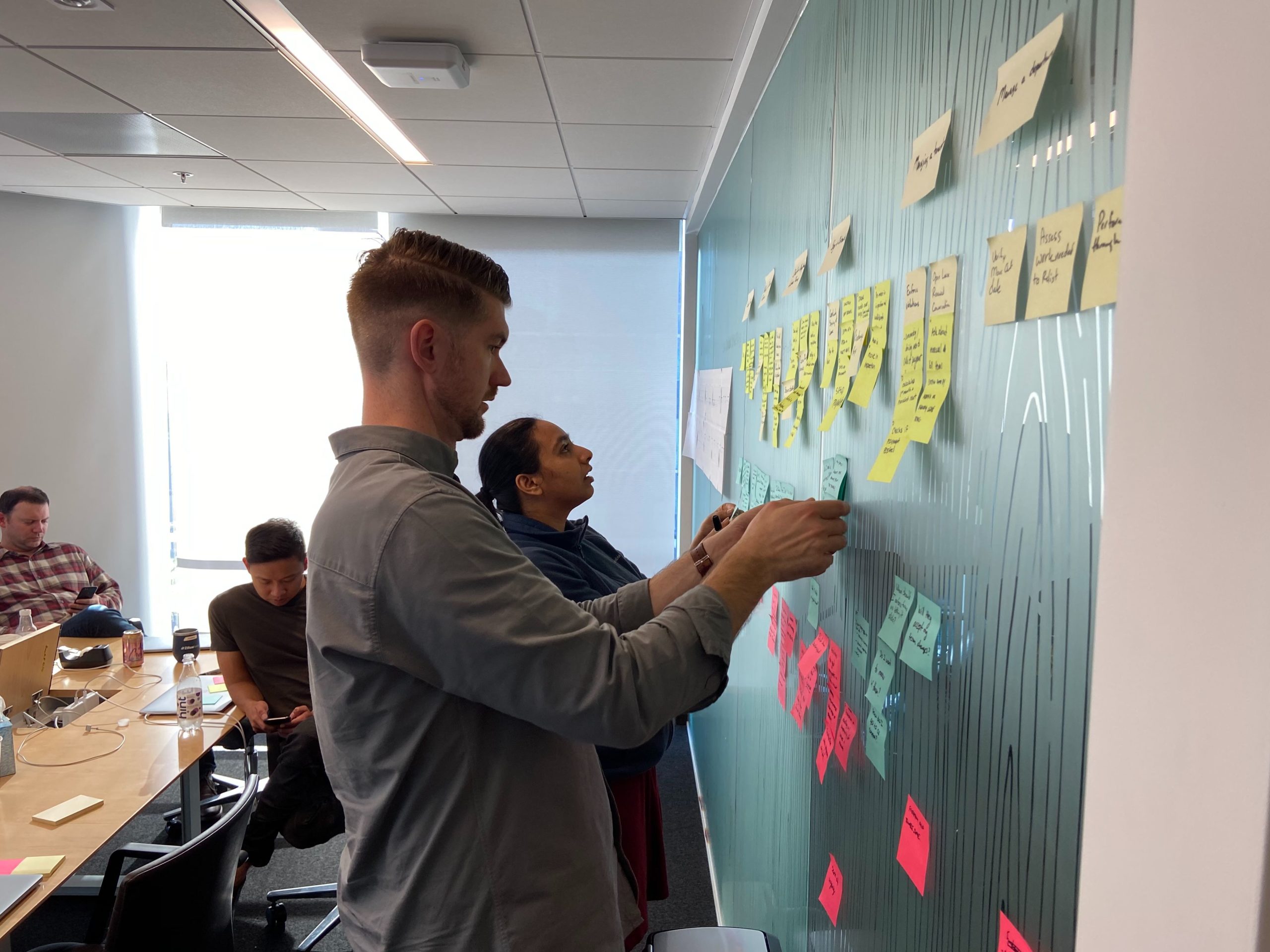
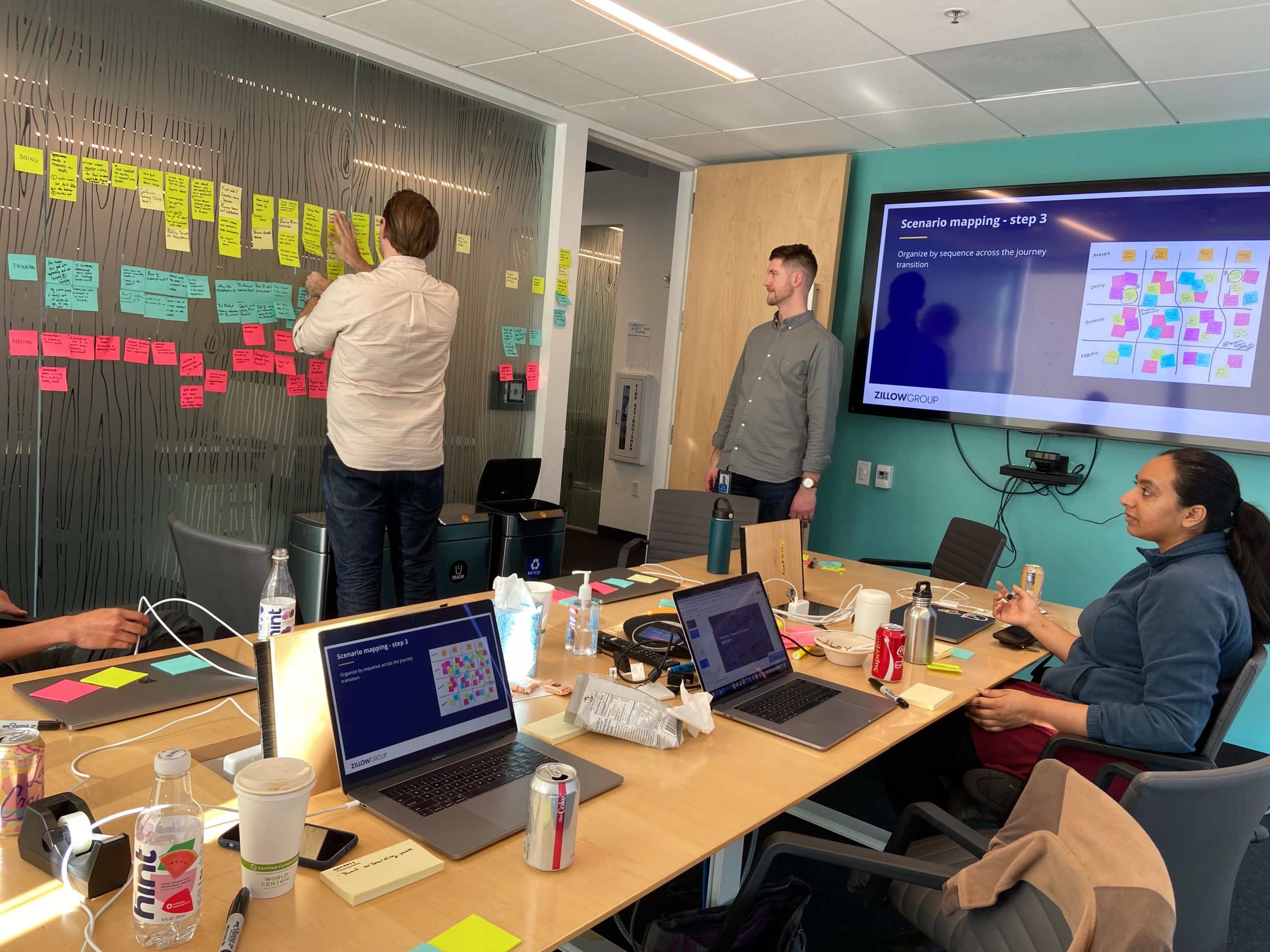
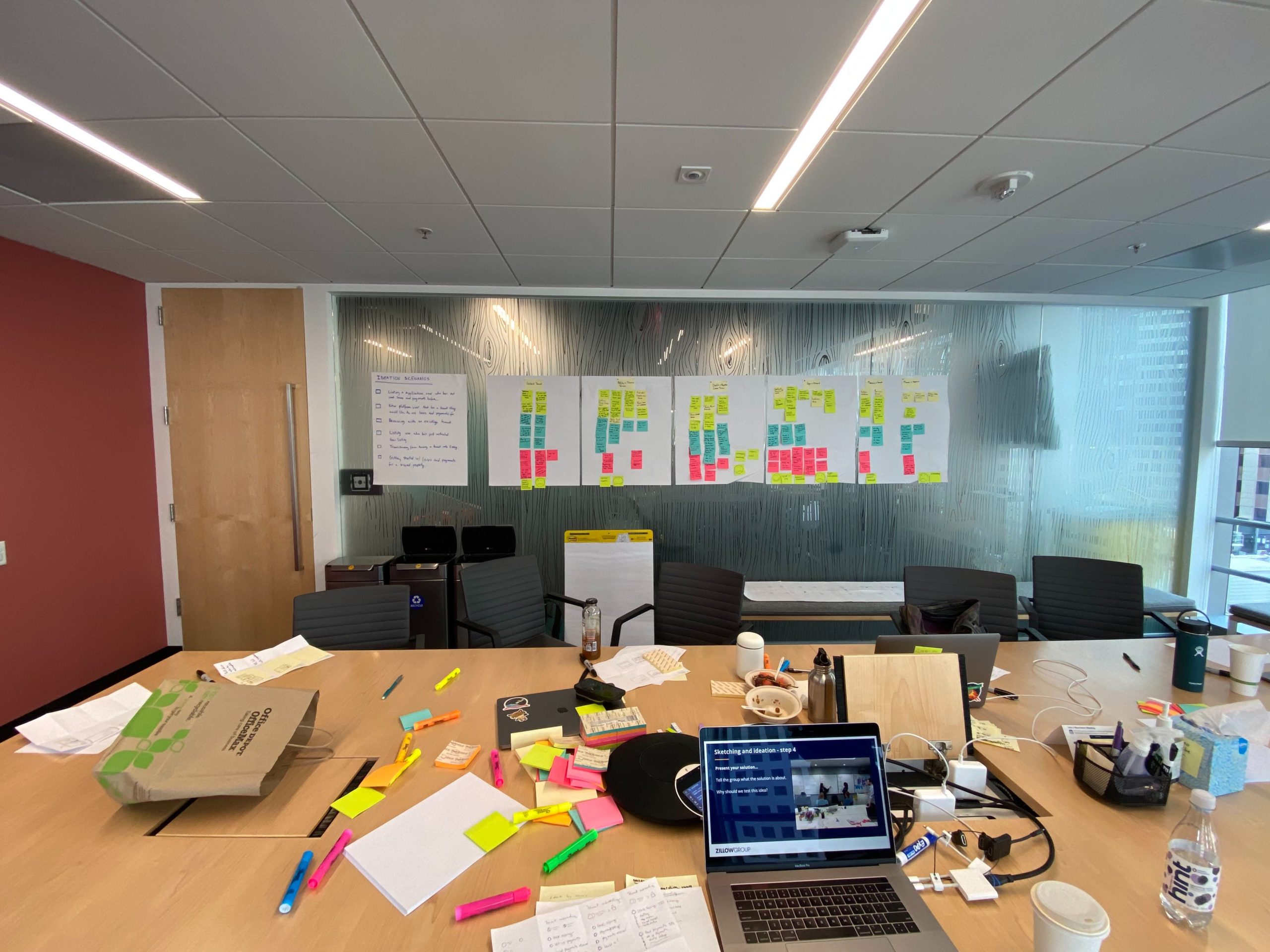
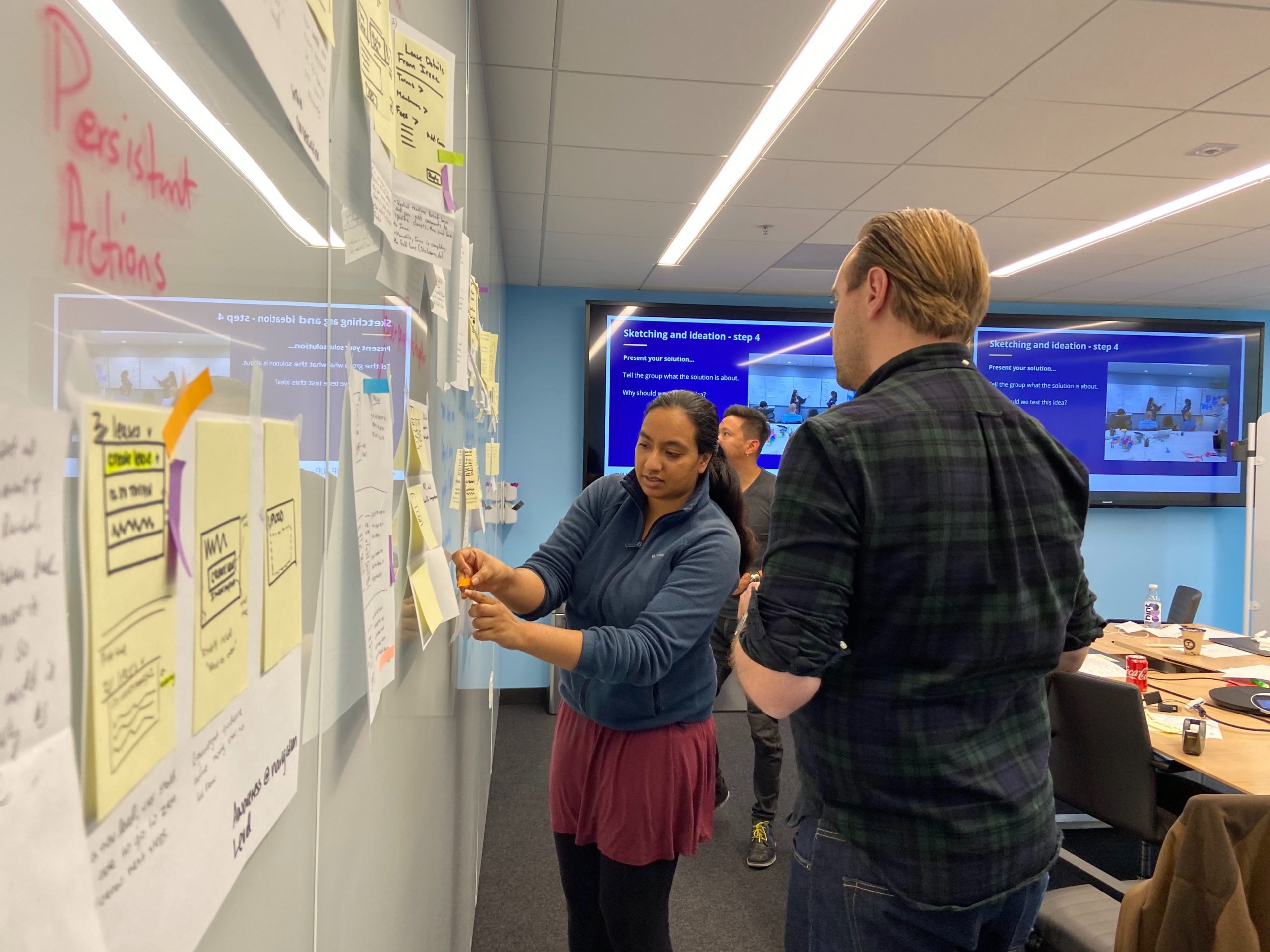
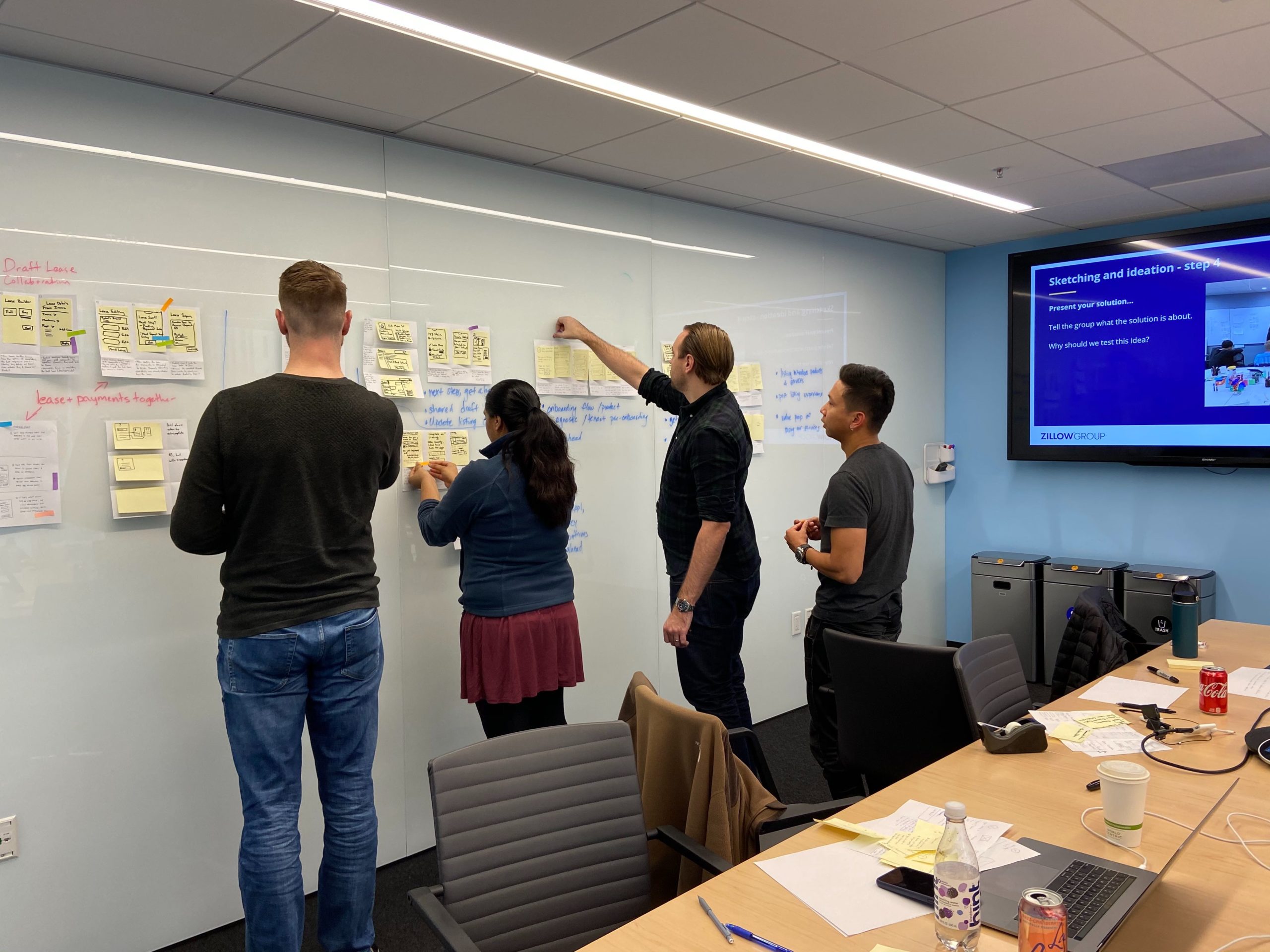
It was time to turn our attention to how the platform should support transitions between phases in a landlord's journey by connecting the tools on it. I planned a design sprint with my two product manager partners and facilitated it to ensure the platform could support our immediate plans and future needs. This required ideation and validation of how tools could connect in an unconstrained future. We chose to focus on the user scenario of securing a new tenant using applications, leases, payments, and the platform's communication tool.
It was time to turn our attention to how the platform should support transitions between phases in a landlord's journey by connecting the tools on it. I planned a design sprint with my two product manager partners and facilitated it to ensure the platform could support our immediate plans and future needs. This required ideation and validation of how tools could connect in an unconstrained future. We chose to focus on the user scenario of securing a new tenant using applications, leases, payments, and the platform's communication tool.
It was time to turn our attention to how the platform should support transitions between phases in a landlord's journey by connecting the tools on it. I planned a design sprint with my two product manager partners and facilitated it to ensure the platform could support our immediate plans and future needs. This required ideation and validation of how tools could connect in an unconstrained future. We chose to focus on the user scenario of securing a new tenant using applications, leases, payments, and the platform's communication tool.
It was time to turn our attention to how the platform should support transitions between phases in a landlord's journey by connecting the tools on it. I planned a design sprint with my two product manager partners and facilitated it to ensure the platform could support our immediate plans and future needs. This required ideation and validation of how tools could connect in an unconstrained future. We chose to focus on the user scenario of securing a new tenant using applications, leases, payments, and the platform's communication tool.
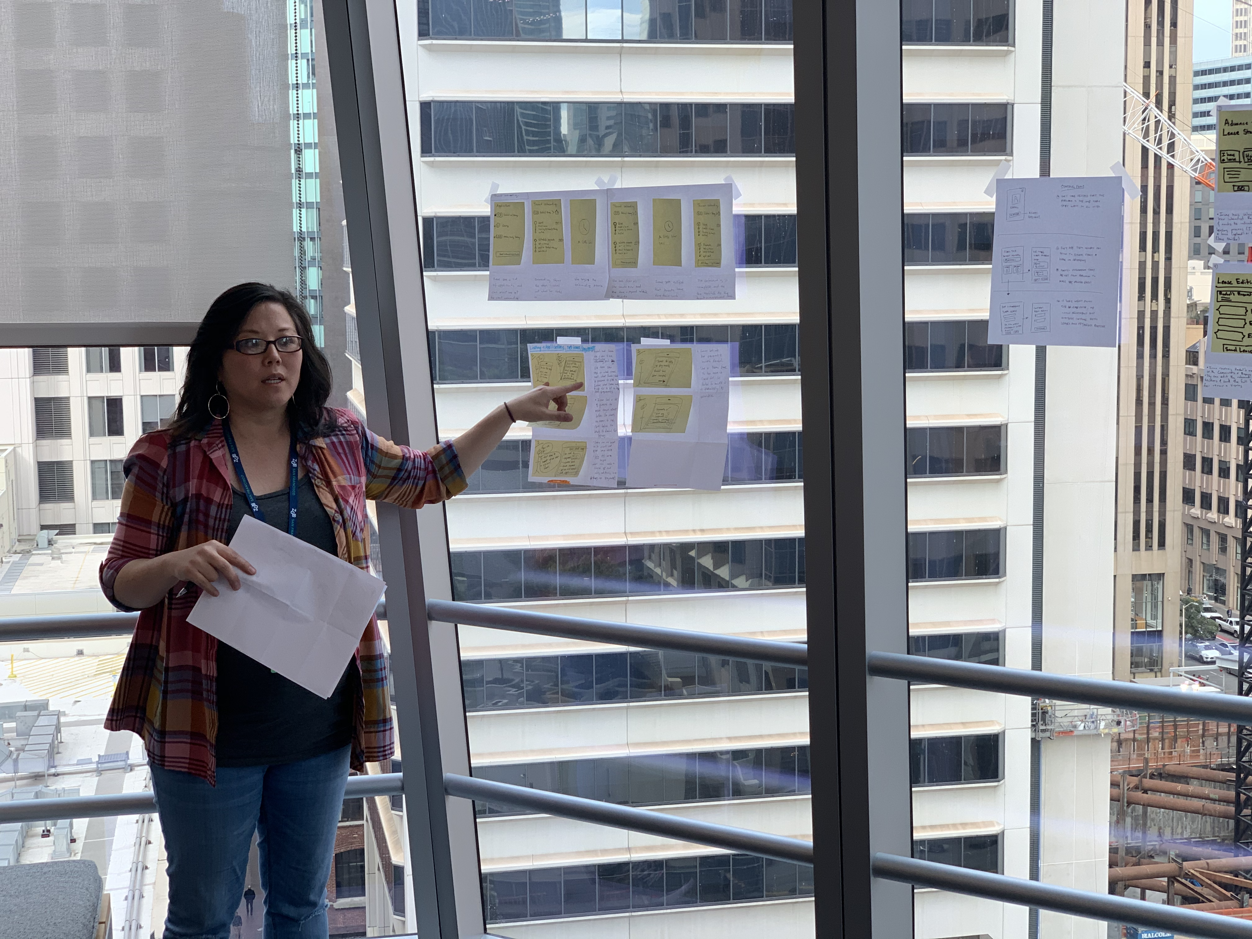
We created two concepts that incorporated ideas from the sprint's ideation phase. The ideas we chose aimed to challenge existing paradigms and push the limits of what is possible. When we tested the two concepts, we learned valuable lessons about how to connect and sequence the tools. We also learned that we should extend the platform information architecture with a new concept we called "Interested Renters" that would bridge renter inquiries to applications, leases, and payments. We followed this up with one final round of usability testing of the new platform to answer a couple of outstanding questions before I moved onto high fidelity designs.
We created two concepts that incorporated ideas from the sprint's ideation phase. The ideas we chose aimed to challenge existing paradigms and push the limits of what is possible. When we tested the two concepts, we learned valuable lessons about how to connect and sequence the tools. We also learned that we should extend the platform information architecture with a new concept we called "Interested Renters" that would bridge renter inquiries to applications, leases, and payments. We followed this up with one final round of usability testing of the new platform to answer a couple of outstanding questions before I moved onto high fidelity designs.
We created two concepts that incorporated ideas from the sprint's ideation phase. The ideas we chose aimed to challenge existing paradigms and push the limits of what is possible. When we tested the two concepts, we learned valuable lessons about how to connect and sequence the tools. We also learned that we should extend the platform information architecture with a new concept we called "Interested Renters" that would bridge renter inquiries to applications, leases, and payments. We followed this up with one final round of usability testing of the new platform to answer a couple of outstanding questions before I moved onto high fidelity designs.
We created two concepts that incorporated ideas from the sprint's ideation phase. The ideas we chose aimed to challenge existing paradigms and push the limits of what is possible. When we tested the two concepts, we learned valuable lessons about how to connect and sequence the tools. We also learned that we should extend the platform information architecture with a new concept we called "Interested Renters" that would bridge renter inquiries to applications, leases, and payments. We followed this up with one final round of usability testing of the new platform to answer a couple of outstanding questions before I moved onto high fidelity designs.
High fidelity designs
High fidelity designs
High fidelity designs
High fidelity designs
I brought my designs into high fidelity and scaled them across platforms. As I fleshed out module states within the new platform architecture, I held user scenario workshops and design reviews with the respective product teams that would own them long term. This allowed me to work from a prioritized list of user scenarios and ensured that these teams were aligned with the plans before handing designs off to development.
I brought my designs into high fidelity and scaled them across platforms. As I fleshed out module states within the new platform architecture, I held user scenario workshops and design reviews with the respective product teams that would own them long term. This allowed me to work from a prioritized list of user scenarios and ensured that these teams were aligned with the plans before handing designs off to development.
I brought my designs into high fidelity and scaled them across platforms. As I fleshed out module states within the new platform architecture, I held user scenario workshops and design reviews with the respective product teams that would own them long term. This allowed me to work from a prioritized list of user scenarios and ensured that these teams were aligned with the plans before handing designs off to development.
I brought my designs into high fidelity and scaled them across platforms. As I fleshed out module states within the new platform architecture, I held user scenario workshops and design reviews with the respective product teams that would own them long term. This allowed me to work from a prioritized list of user scenarios and ensured that these teams were aligned with the plans before handing designs off to development.
Information architecture
Information architecture
Information architecture
Information architecture
The top-level information architecture of the redesigned platform is Properties, Inbox, Help, Notifications, and Me. Properties is home to a property-centric mode of working and Inbox is home for a communications-centric mode of working. Help contains a menu that links to the landlord resource center and the help center. Notifications opens a panel that shows all platform events in chronological order but without emphasizing type, importance and urgency. The Me menu shows a menu of locations where users can manage settings related to their account.
The top-level information architecture of the redesigned platform is Properties, Inbox, Help, Notifications, and Me. Properties is home to a property-centric mode of working and Inbox is home for a communications-centric mode of working. Help contains a menu that links to the landlord resource center and the help center. Notifications opens a panel that shows all platform events in chronological order but without emphasizing type, importance and urgency. The Me menu shows a menu of locations where users can manage settings related to their account.
The top-level information architecture of the redesigned platform is Properties, Inbox, Help, Notifications, and Me. Properties is home to a property-centric mode of working and Inbox is home for a communications-centric mode of working. Help contains a menu that links to the landlord resource center and the help center. Notifications opens a panel that shows all platform events in chronological order but without emphasizing type, importance and urgency. The Me menu shows a menu of locations where users can manage settings related to their account.
The top-level information architecture of the redesigned platform is Properties, Inbox, Help, Notifications, and Me. Properties is home to a property-centric mode of working and Inbox is home for a communications-centric mode of working. Help contains a menu that links to the landlord resource center and the help center. Notifications opens a panel that shows all platform events in chronological order but without emphasizing type, importance and urgency. The Me menu shows a menu of locations where users can manage settings related to their account.

Properties page
Properties page
Properties page
Properties page
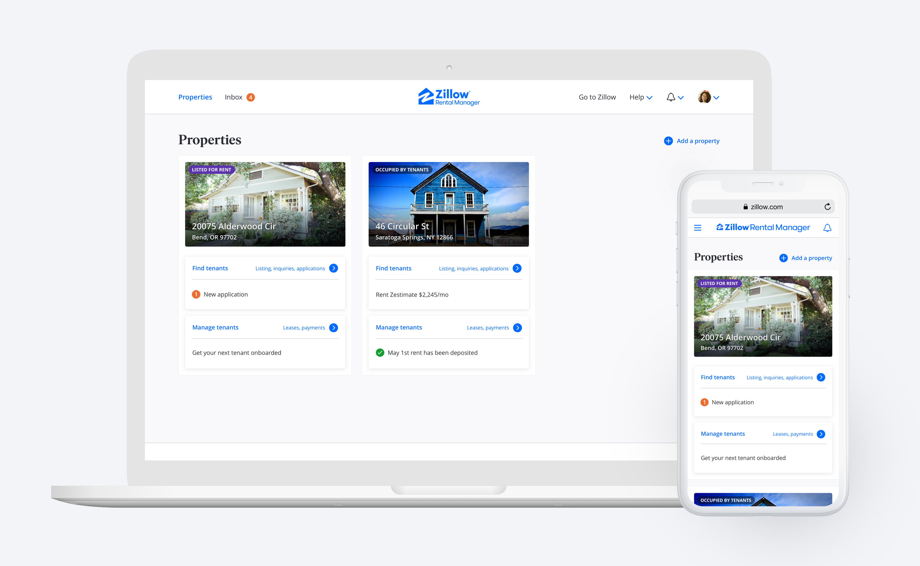
The Properties page is the default landing page when landlords visit the Zillow Rental Manager platform. Throughout our concept testing, landlords consistently expressed a desire to start with an overview of their properties. The notification-based alternatives we tested got mixed feedback at best. My approach was to pull notifications into the Properties page and apply distinct treatments to signal type, importance, and urgency of events to solve the Memory Challenge usability problem. This required a hierarchy of logic to determine what gets shown when. The hierarchy we defined is based on importance and urgency relative to where the user is in their journey.
The Properties page is the default landing page when landlords visit the Zillow Rental Manager platform. Throughout our concept testing, landlords consistently expressed a desire to start with an overview of their properties. The notification-based alternatives we tested got mixed feedback at best. My approach was to pull notifications into the Properties page and apply distinct treatments to signal type, importance, and urgency of events to solve the Memory Challenge usability problem. This required a hierarchy of logic to determine what gets shown when. The hierarchy we defined is based on importance and urgency relative to where the user is in their journey.
The Properties page is the default landing page when landlords visit the Zillow Rental Manager platform. Throughout our concept testing, landlords consistently expressed a desire to start with an overview of their properties. The notification-based alternatives we tested got mixed feedback at best. My approach was to pull notifications into the Properties page and apply distinct treatments to signal type, importance, and urgency of events to solve the Memory Challenge usability problem. This required a hierarchy of logic to determine what gets shown when. The hierarchy we defined is based on importance and urgency relative to where the user is in their journey.
The Properties page is the default landing page when landlords visit the Zillow Rental Manager platform. Throughout our concept testing, landlords consistently expressed a desire to start with an overview of their properties. The notification-based alternatives we tested got mixed feedback at best. My approach was to pull notifications into the Properties page and apply distinct treatments to signal type, importance, and urgency of events to solve the Memory Challenge usability problem. This required a hierarchy of logic to determine what gets shown when. The hierarchy we defined is based on importance and urgency relative to where the user is in their journey.
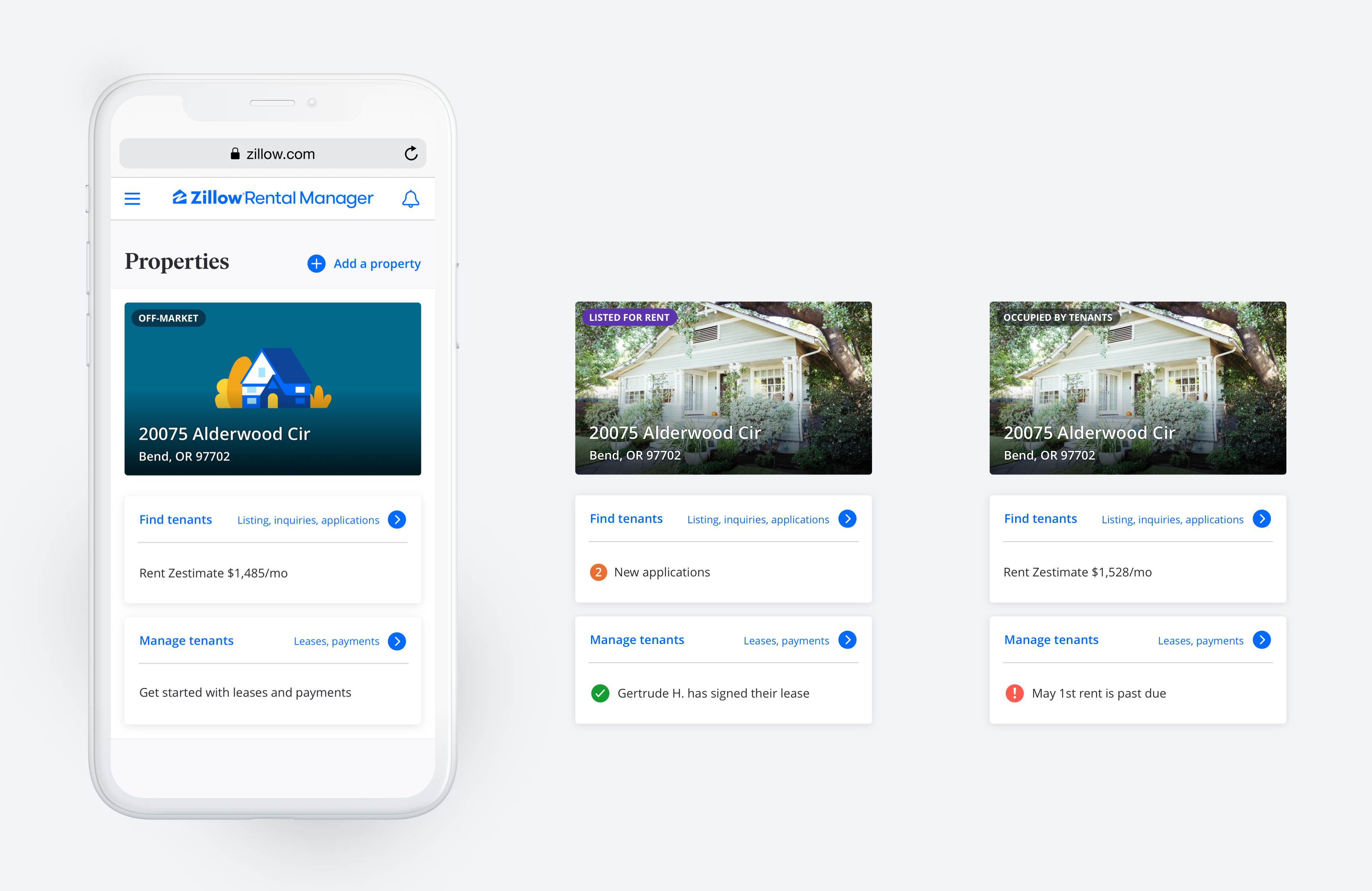
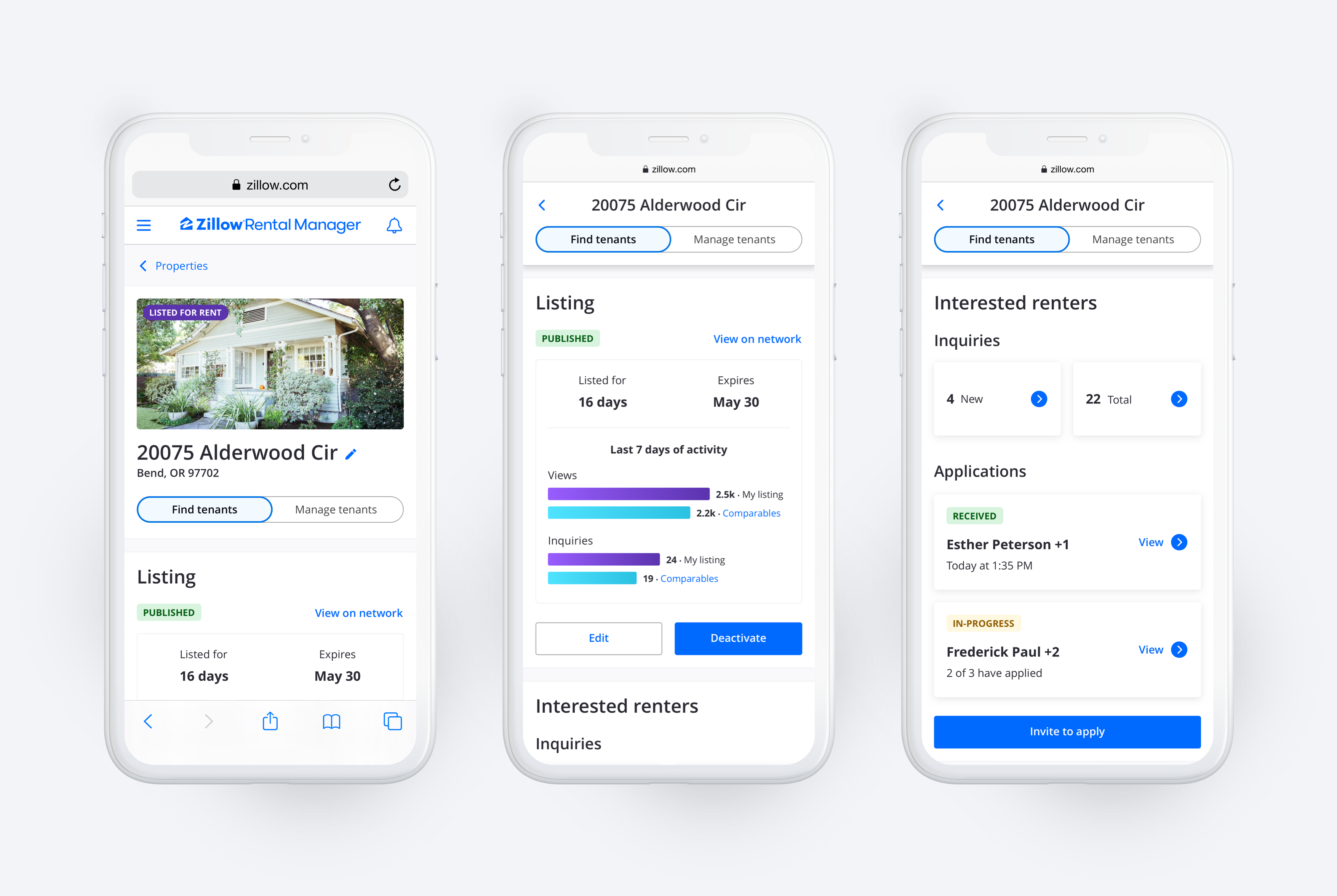
Each property card has two interactive panels that link to outcome-centered views of that property - the Find Tenants and Manage Tenants views. These two labels tested well. Participants consistently predicted that Find Tenants represents a location where they can use listings, inquiries, and applications and that Manage Tenants represents a location where they can use leases and payments. While they naturally associate these outcome-based labels with the right tools, I provided additional explanation in the card titles to help with rehabituation of existing users.
Each property card has two interactive panels that link to outcome-centered views of that property - the Find Tenants and Manage Tenants views. These two labels tested well. Participants consistently predicted that Find Tenants represents a location where they can use listings, inquiries, and applications and that Manage Tenants represents a location where they can use leases and payments. While they naturally associate these outcome-based labels with the right tools, I provided additional explanation in the card titles to help with rehabituation of existing users.
Each property card has two interactive panels that link to outcome-centered views of that property - the Find Tenants and Manage Tenants views. These two labels tested well. Participants consistently predicted that Find Tenants represents a location where they can use listings, inquiries, and applications and that Manage Tenants represents a location where they can use leases and payments. While they naturally associate these outcome-based labels with the right tools, I provided additional explanation in the card titles to help with rehabituation of existing users.
Each property card has two interactive panels that link to outcome-centered views of that property - the Find Tenants and Manage Tenants views. These two labels tested well. Participants consistently predicted that Find Tenants represents a location where they can use listings, inquiries, and applications and that Manage Tenants represents a location where they can use leases and payments. While they naturally associate these outcome-based labels with the right tools, I provided additional explanation in the card titles to help with rehabituation of existing users.
Outcome-centered views of a property
Outcome-centered views of a property
Outcome-centered views of a property
Outcome-centered views of a property
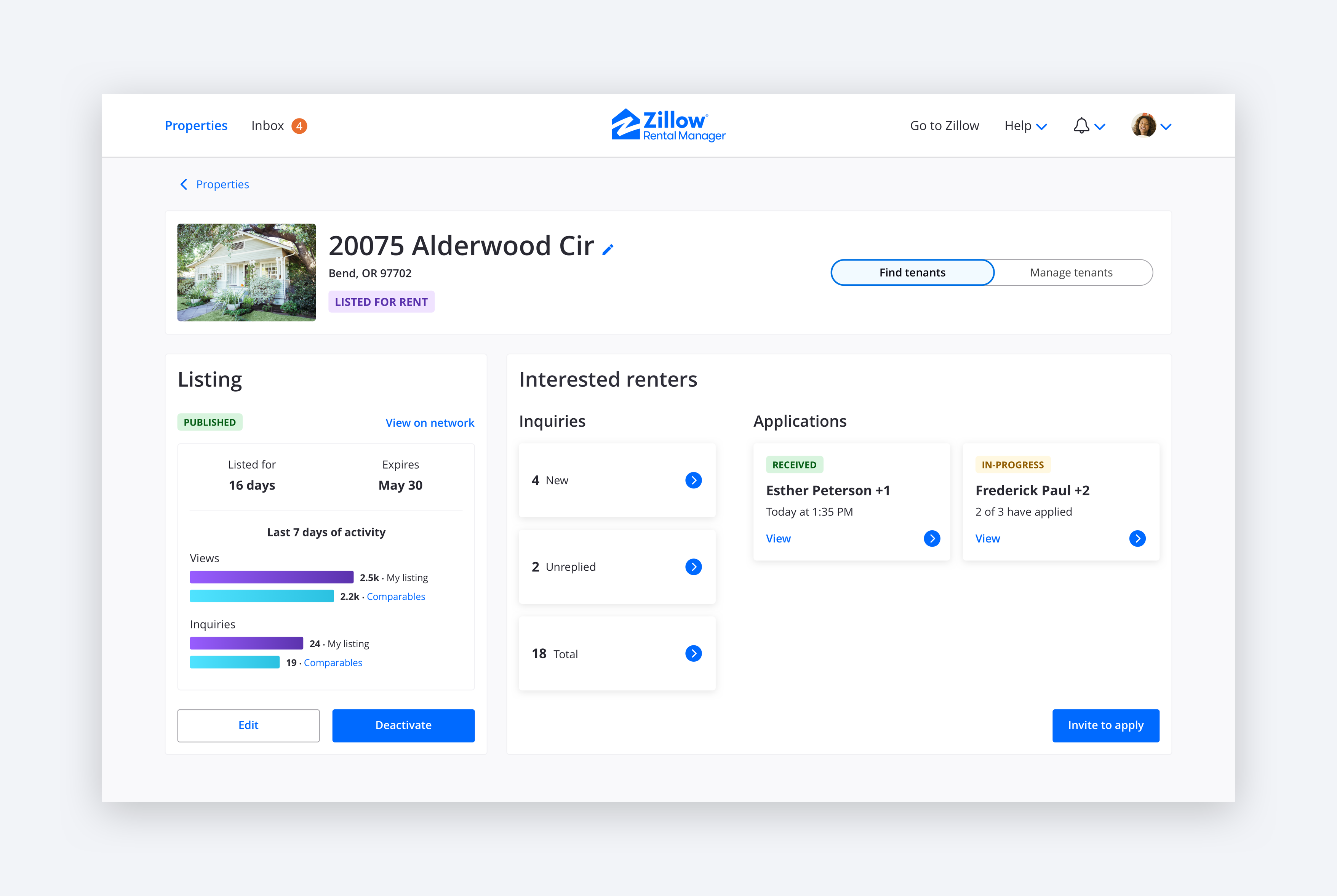
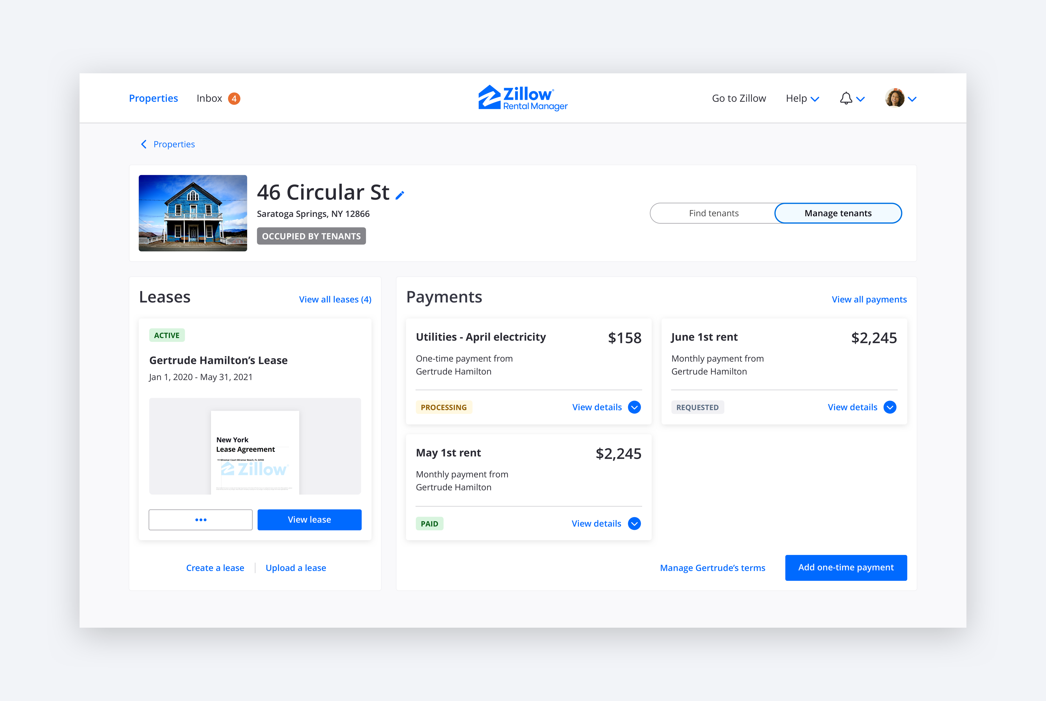
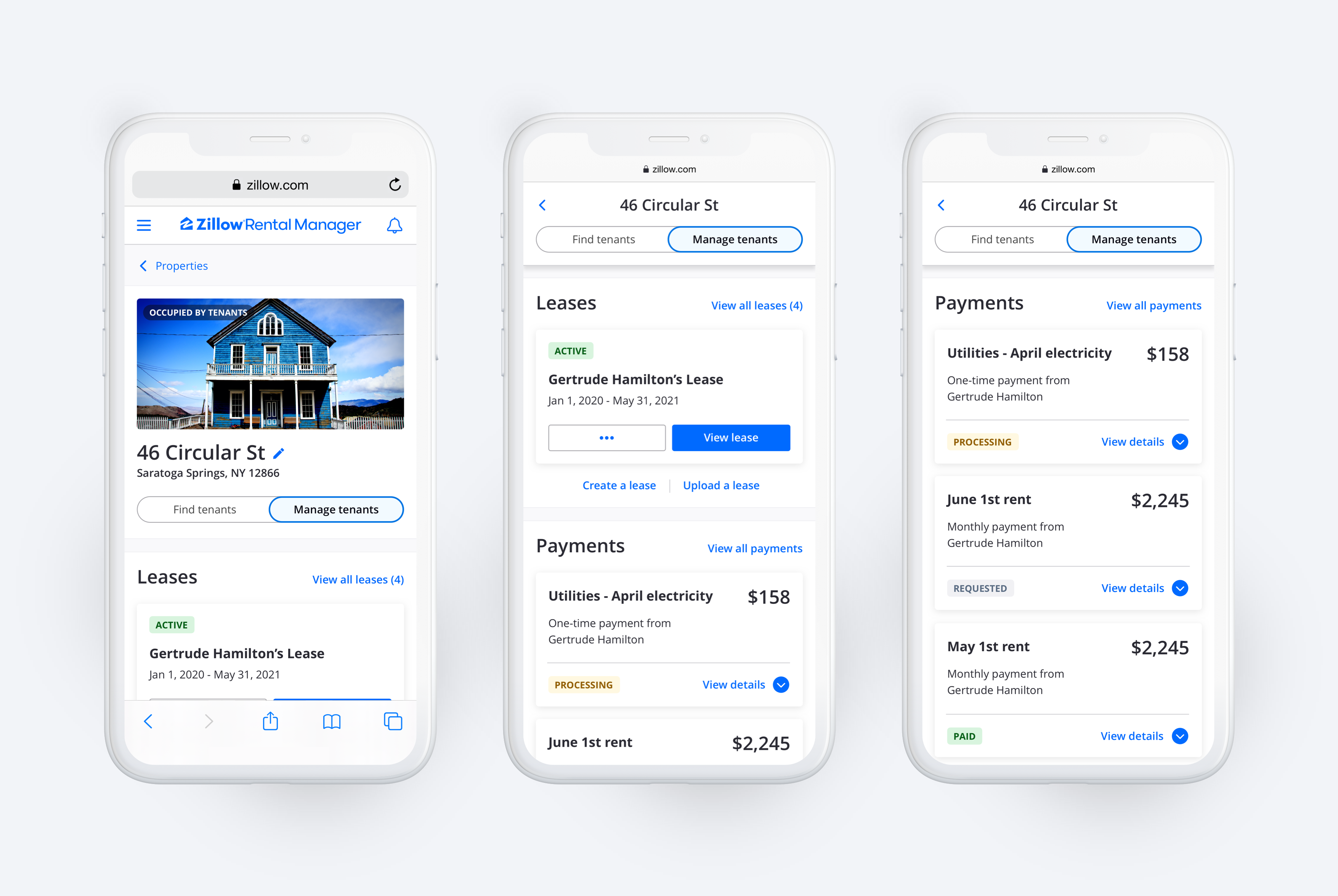
The most radical departure from the previous platform design is the two outcome-centered views of a property. This is also where the most severe usability problems existed prior to the redesign. The new Find Tenants and Manage Tenants views of a property aim to combat the Ambiguous Home and Poor Grouping usability problems. The Find Tenants view orients landlords to stay on track toward the goal of finding new tenants. This is done with a focus on listing your property and having an overview of renters interested in your property. The aim of the Manage Tenants view is to orient landlords to stay on track toward their goal of managing tenants in the property. This is done through a focus on leases and the flow of payments.
The most radical departure from the previous platform design is the two outcome-centered views of a property. This is also where the most severe usability problems existed prior to the redesign. The new Find Tenants and Manage Tenants views of a property aim to combat the Ambiguous Home and Poor Grouping usability problems. The Find Tenants view orients landlords to stay on track toward the goal of finding new tenants. This is done with a focus on listing your property and having an overview of renters interested in your property. The aim of the Manage Tenants view is to orient landlords to stay on track toward their goal of managing tenants in the property. This is done through a focus on leases and the flow of payments.
The most radical departure from the previous platform design is the two outcome-centered views of a property. This is also where the most severe usability problems existed prior to the redesign. The new Find Tenants and Manage Tenants views of a property aim to combat the Ambiguous Home and Poor Grouping usability problems. The Find Tenants view orients landlords to stay on track toward the goal of finding new tenants. This is done with a focus on listing your property and having an overview of renters interested in your property. The aim of the Manage Tenants view is to orient landlords to stay on track toward their goal of managing tenants in the property. This is done through a focus on leases and the flow of payments.
The most radical departure from the previous platform design is the two outcome-centered views of a property. This is also where the most severe usability problems existed prior to the redesign. The new Find Tenants and Manage Tenants views of a property aim to combat the Ambiguous Home and Poor Grouping usability problems. The Find Tenants view orients landlords to stay on track toward the goal of finding new tenants. This is done with a focus on listing your property and having an overview of renters interested in your property. The aim of the Manage Tenants view is to orient landlords to stay on track toward their goal of managing tenants in the property. This is done through a focus on leases and the flow of payments.
The property header shows the overall status of the property and allows the user to switch between the Find Tenants and Manage Tenants views. Both views highlight only the most pertinent elements for landlords and push less relevant elements to tool-specific detail views for record keeping. This approach enables landlords to easily understand what they should do next to stay on track, what is new since their last visit, and catch up on relevant events they might have missed.
The property header shows the overall status of the property and allows the user to switch between the Find Tenants and Manage Tenants views. Both views highlight only the most pertinent elements for landlords and push less relevant elements to tool-specific detail views for record keeping. This approach enables landlords to easily understand what they should do next to stay on track, what is new since their last visit, and catch up on relevant events they might have missed.
The property header shows the overall status of the property and allows the user to switch between the Find Tenants and Manage Tenants views. Both views highlight only the most pertinent elements for landlords and push less relevant elements to tool-specific detail views for record keeping. This approach enables landlords to easily understand what they should do next to stay on track, what is new since their last visit, and catch up on relevant events they might have missed.
The property header shows the overall status of the property and allows the user to switch between the Find Tenants and Manage Tenants views. Both views highlight only the most pertinent elements for landlords and push less relevant elements to tool-specific detail views for record keeping. This approach enables landlords to easily understand what they should do next to stay on track, what is new since their last visit, and catch up on relevant events they might have missed.
The Find Tenants experience
The Find Tenants experience
The Find Tenants experience
The Find Tenants experience
The journey to find new tenants is an intense period for most landlords. They have just prepared the rental home and are now ready to show it to renters. The first step is to publish the listing so renters know the property is available. The next step is to respond to inquiries from interested renters and schedule tours of the property. Renters who remain interested after seeing the property will then submit a rental application. Landlords use these applications to screen the renters and select who they would like to have as their next tenants.
The journey to find new tenants is an intense period for most landlords. They have just prepared the rental home and are now ready to show it to renters. The first step is to publish the listing so renters know the property is available. The next step is to respond to inquiries from interested renters and schedule tours of the property. Renters who remain interested after seeing the property will then submit a rental application. Landlords use these applications to screen the renters and select who they would like to have as their next tenants.
The journey to find new tenants is an intense period for most landlords. They have just prepared the rental home and are now ready to show it to renters. The first step is to publish the listing so renters know the property is available. The next step is to respond to inquiries from interested renters and schedule tours of the property. Renters who remain interested after seeing the property will then submit a rental application. Landlords use these applications to screen the renters and select who they would like to have as their next tenants.
The journey to find new tenants is an intense period for most landlords. They have just prepared the rental home and are now ready to show it to renters. The first step is to publish the listing so renters know the property is available. The next step is to respond to inquiries from interested renters and schedule tours of the property. Renters who remain interested after seeing the property will then submit a rental application. Landlords use these applications to screen the renters and select who they would like to have as their next tenants.
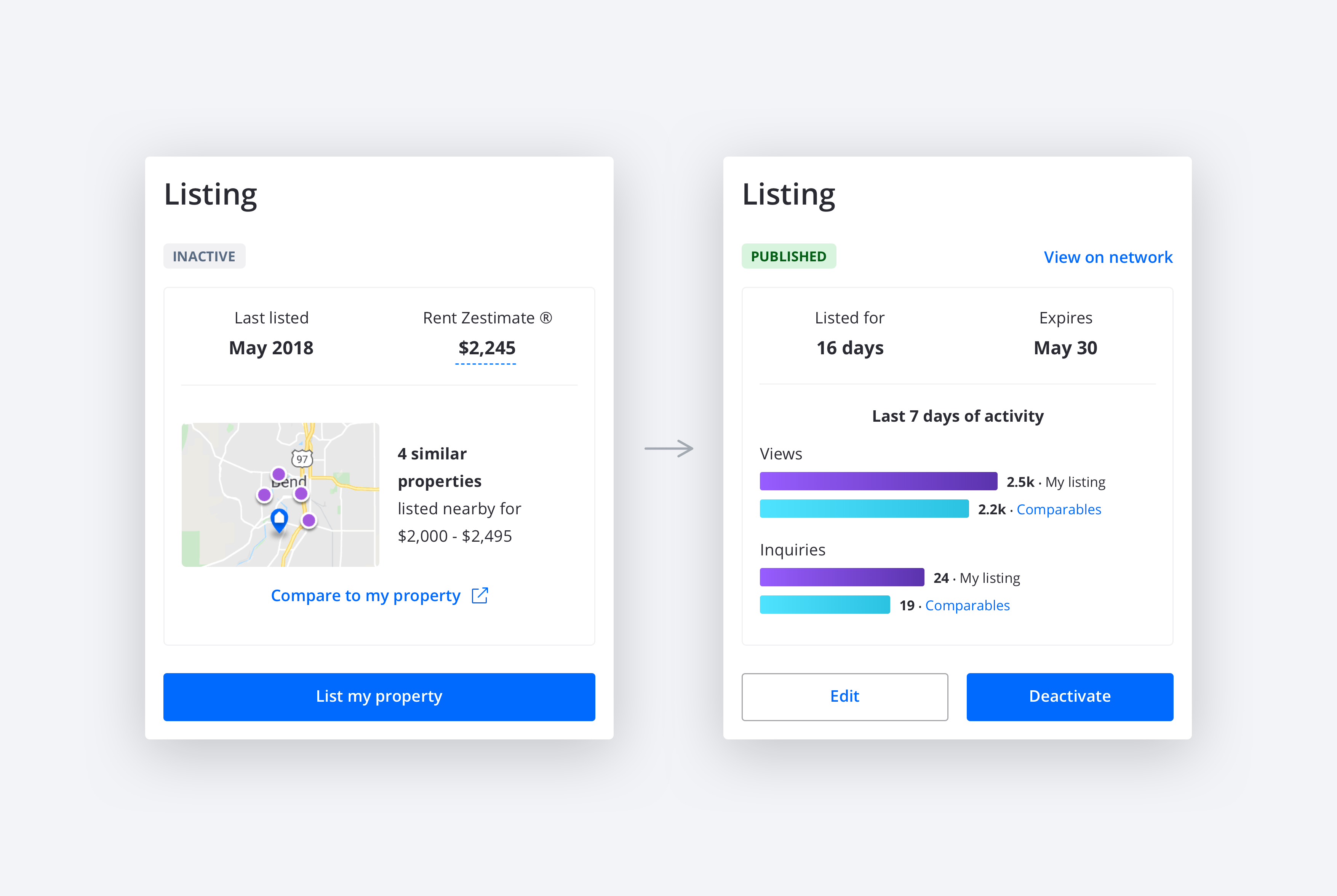
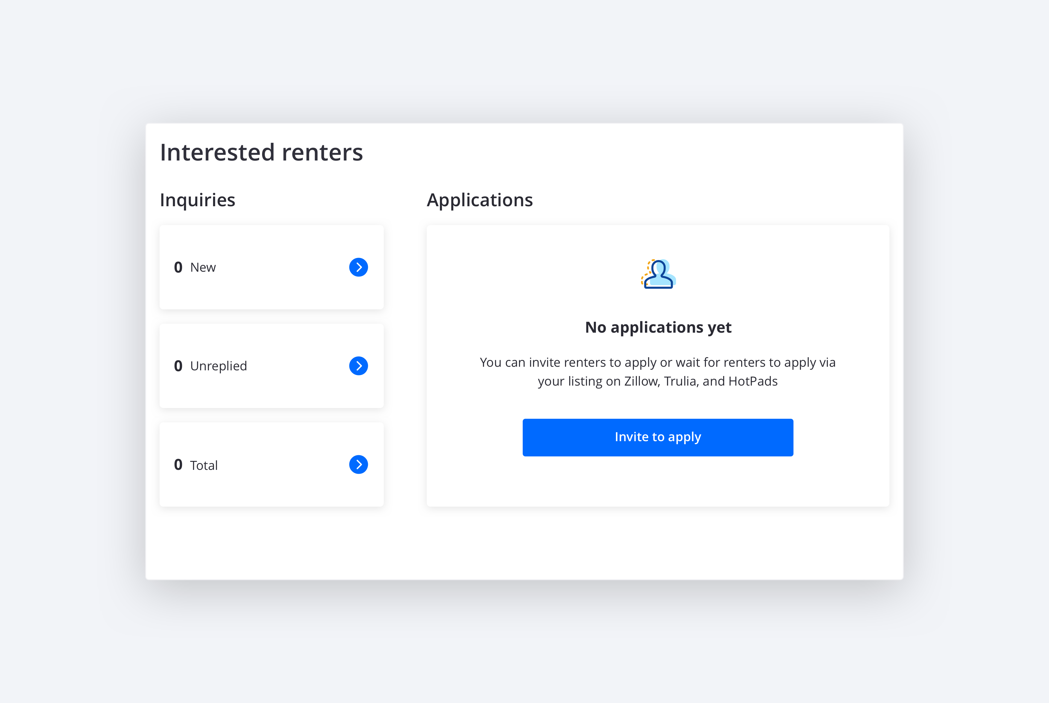
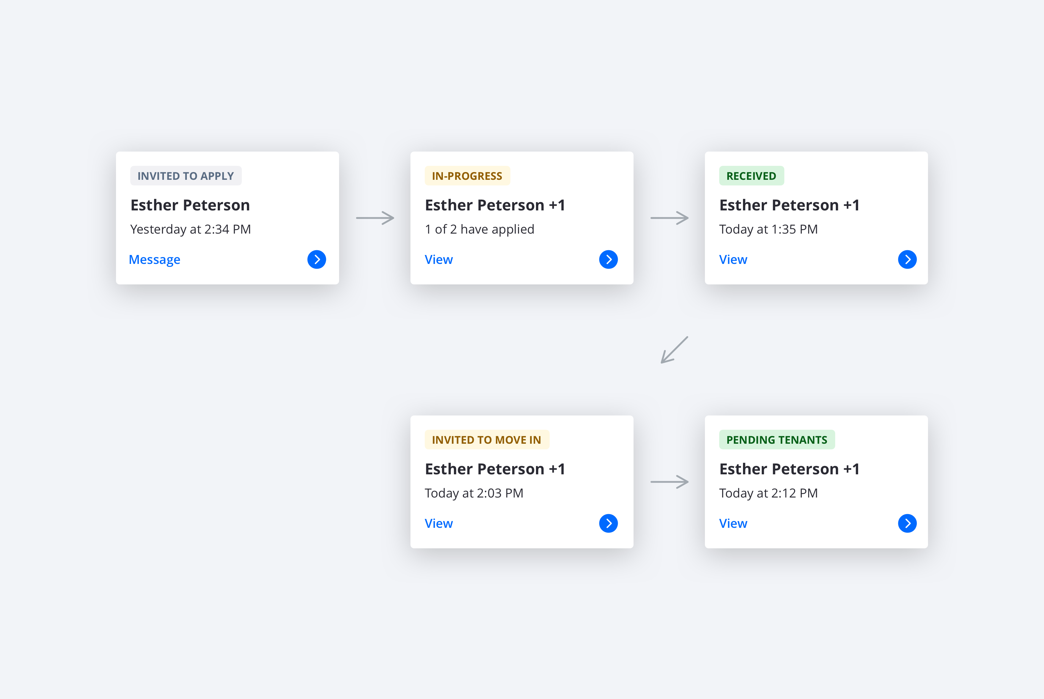
The listing tool is used to list the property on Zillow, Trulia, and HotPads. Before publishing the listing, the Listing module helps landlords determine the rent price. After listing, it helps them understand how their renter interest compares to similar rentals. The inquiries from renters are summarized in the Interested Renters module, which links the landlord to the Inbox to respond and schedule showings. Once renters are invited to apply, they show up as an applicant on the Interested Renters module. Here landlords can track the progress of their application, review it when fully received, and initiate the last steps toward making them their tenants.
The listing tool is used to list the property on Zillow, Trulia, and HotPads. Before publishing the listing, the Listing module helps landlords determine the rent price. After listing, it helps them understand how their renter interest compares to similar rentals. The inquiries from renters are summarized in the Interested Renters module, which links the landlord to the Inbox to respond and schedule showings. Once renters are invited to apply, they show up as an applicant on the Interested Renters module. Here landlords can track the progress of their application, review it when fully received, and initiate the last steps toward making them their tenants.
The listing tool is used to list the property on Zillow, Trulia, and HotPads. Before publishing the listing, the Listing module helps landlords determine the rent price. After listing, it helps them understand how their renter interest compares to similar rentals. The inquiries from renters are summarized in the Interested Renters module, which links the landlord to the Inbox to respond and schedule showings. Once renters are invited to apply, they show up as an applicant on the Interested Renters module. Here landlords can track the progress of their application, review it when fully received, and initiate the last steps toward making them their tenants.
The listing tool is used to list the property on Zillow, Trulia, and HotPads. Before publishing the listing, the Listing module helps landlords determine the rent price. After listing, it helps them understand how their renter interest compares to similar rentals. The inquiries from renters are summarized in the Interested Renters module, which links the landlord to the Inbox to respond and schedule showings. Once renters are invited to apply, they show up as an applicant on the Interested Renters module. Here landlords can track the progress of their application, review it when fully received, and initiate the last steps toward making them their tenants.
The System Amnesia and Unnecessary Steps usability problems are solved by adding insights to the listing module and by creating the Interested Renters module. This helps landlords identify what to do next in regards to managing the property's listing and turning renter inquiries into tours and applications. There is a gap though. The platform does not yet handle the management of tours. We have plans to add that in the future.
The System Amnesia and Unnecessary Steps usability problems are solved by adding insights to the listing module and by creating the Interested Renters module. This helps landlords identify what to do next in regards to managing the property's listing and turning renter inquiries into tours and applications. There is a gap though. The platform does not yet handle the management of tours. We have plans to add that in the future.
The System Amnesia and Unnecessary Steps usability problems are solved by adding insights to the listing module and by creating the Interested Renters module. This helps landlords identify what to do next in regards to managing the property's listing and turning renter inquiries into tours and applications. There is a gap though. The platform does not yet handle the management of tours. We have plans to add that in the future.
The System Amnesia and Unnecessary Steps usability problems are solved by adding insights to the listing module and by creating the Interested Renters module. This helps landlords identify what to do next in regards to managing the property's listing and turning renter inquiries into tours and applications. There is a gap though. The platform does not yet handle the management of tours. We have plans to add that in the future.
The Manage Tenants experience
The Manage Tenants experience
The Manage Tenants experience
The Manage Tenants experience
Landlords' journeys to manage tenants start by them creating a lease and getting it signed by the applicants. At this point, landlords will also collect initial payments. The tenant then receives the keys to the property and moves in. This starts a period of relative low activity for landlords. They monitor on-time rent payment and respond to maintenance requests. When the lease is about to expire, the landlord typically asks the tenant if they would like to rent the property longer. This can warrant a new lease and an adjustment of the rent price. If not, the landlord will embark on the tenant finding journey once again.
Landlords' journeys to manage tenants start by them creating a lease and getting it signed by the applicants. At this point, landlords will also collect initial payments. The tenant then receives the keys to the property and moves in. This starts a period of relative low activity for landlords. They monitor on-time rent payment and respond to maintenance requests. When the lease is about to expire, the landlord typically asks the tenant if they would like to rent the property longer. This can warrant a new lease and an adjustment of the rent price. If not, the landlord will embark on the tenant finding journey once again.
Landlords' journeys to manage tenants start by them creating a lease and getting it signed by the applicants. At this point, landlords will also collect initial payments. The tenant then receives the keys to the property and moves in. This starts a period of relative low activity for landlords. They monitor on-time rent payment and respond to maintenance requests. When the lease is about to expire, the landlord typically asks the tenant if they would like to rent the property longer. This can warrant a new lease and an adjustment of the rent price. If not, the landlord will embark on the tenant finding journey once again.
Landlords' journeys to manage tenants start by them creating a lease and getting it signed by the applicants. At this point, landlords will also collect initial payments. The tenant then receives the keys to the property and moves in. This starts a period of relative low activity for landlords. They monitor on-time rent payment and respond to maintenance requests. When the lease is about to expire, the landlord typically asks the tenant if they would like to rent the property longer. This can warrant a new lease and an adjustment of the rent price. If not, the landlord will embark on the tenant finding journey once again.
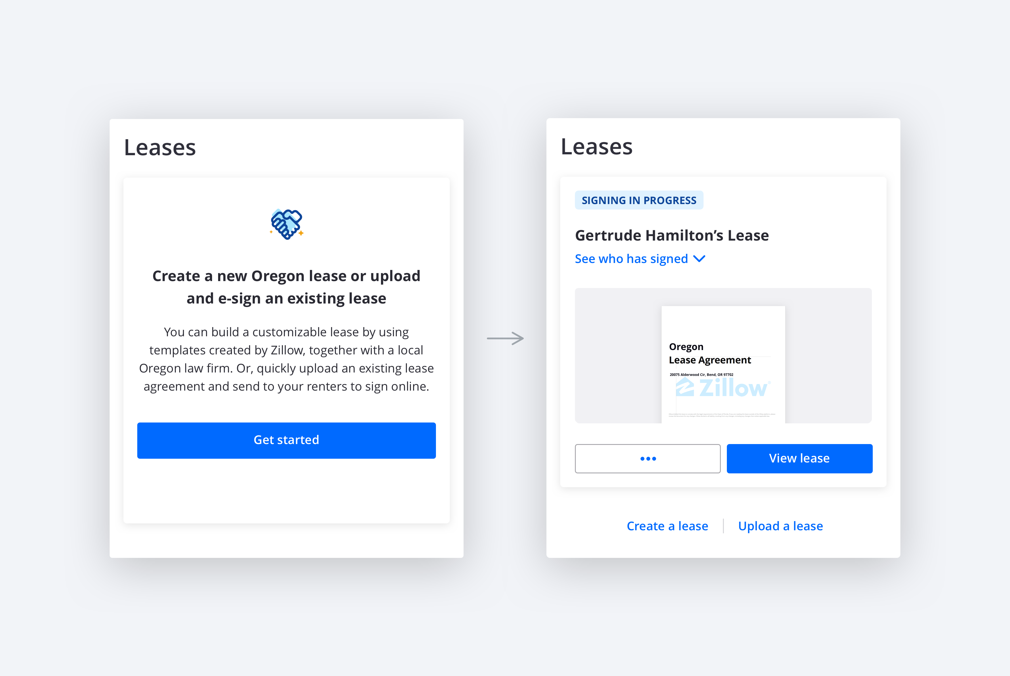
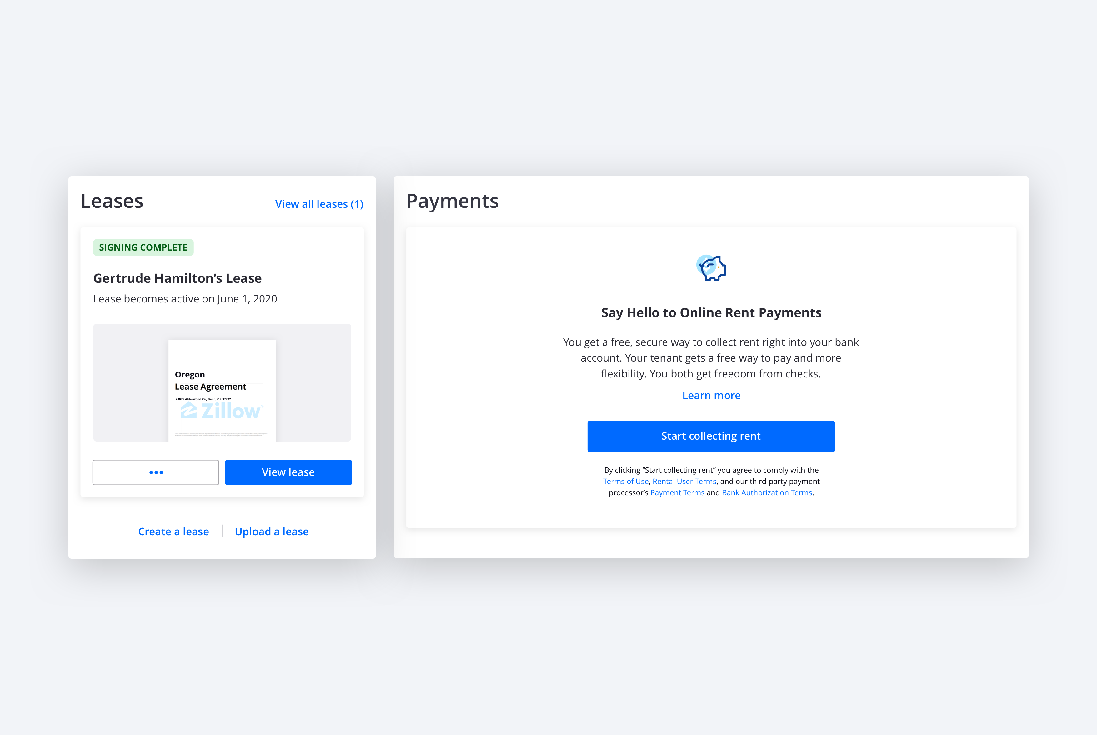
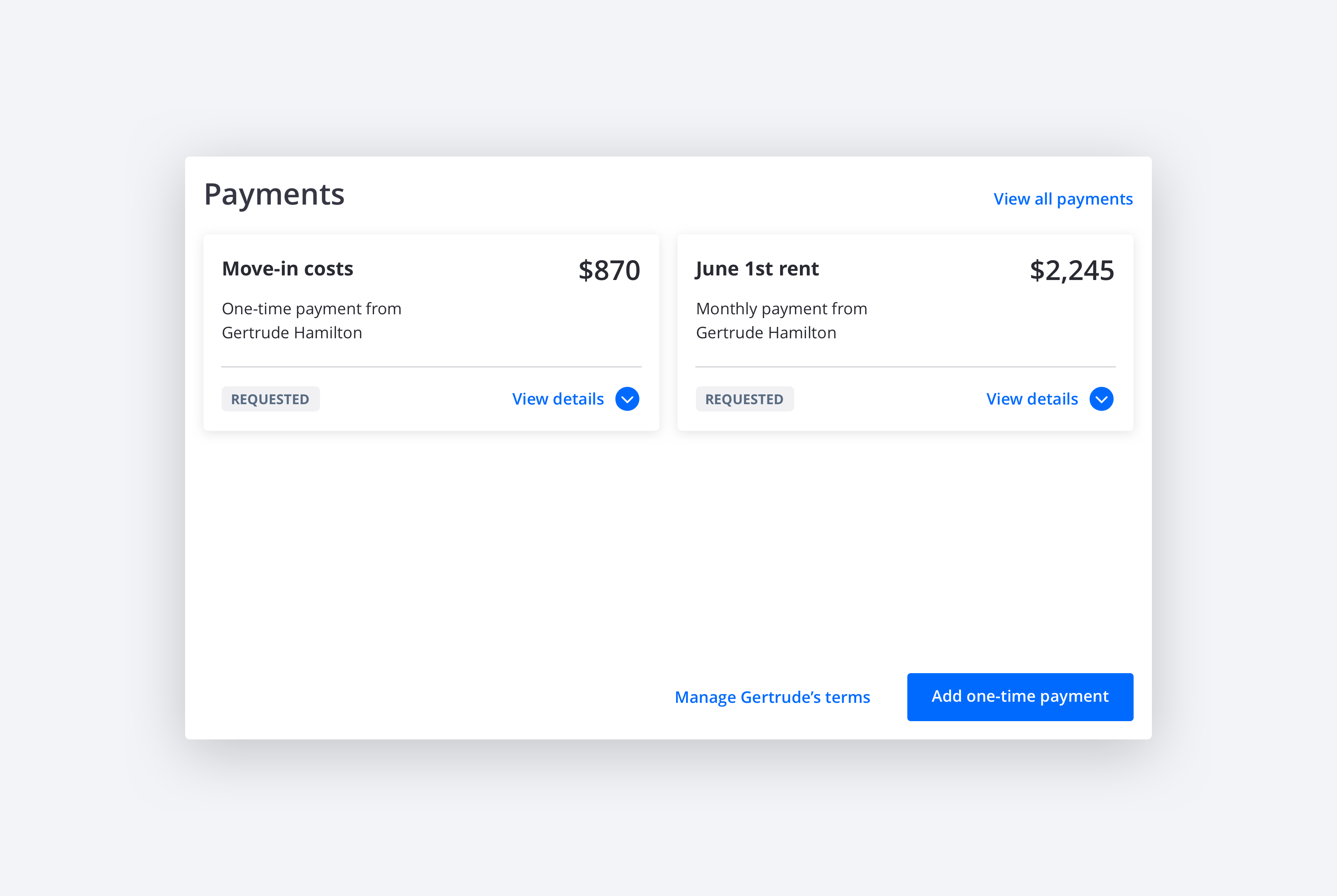
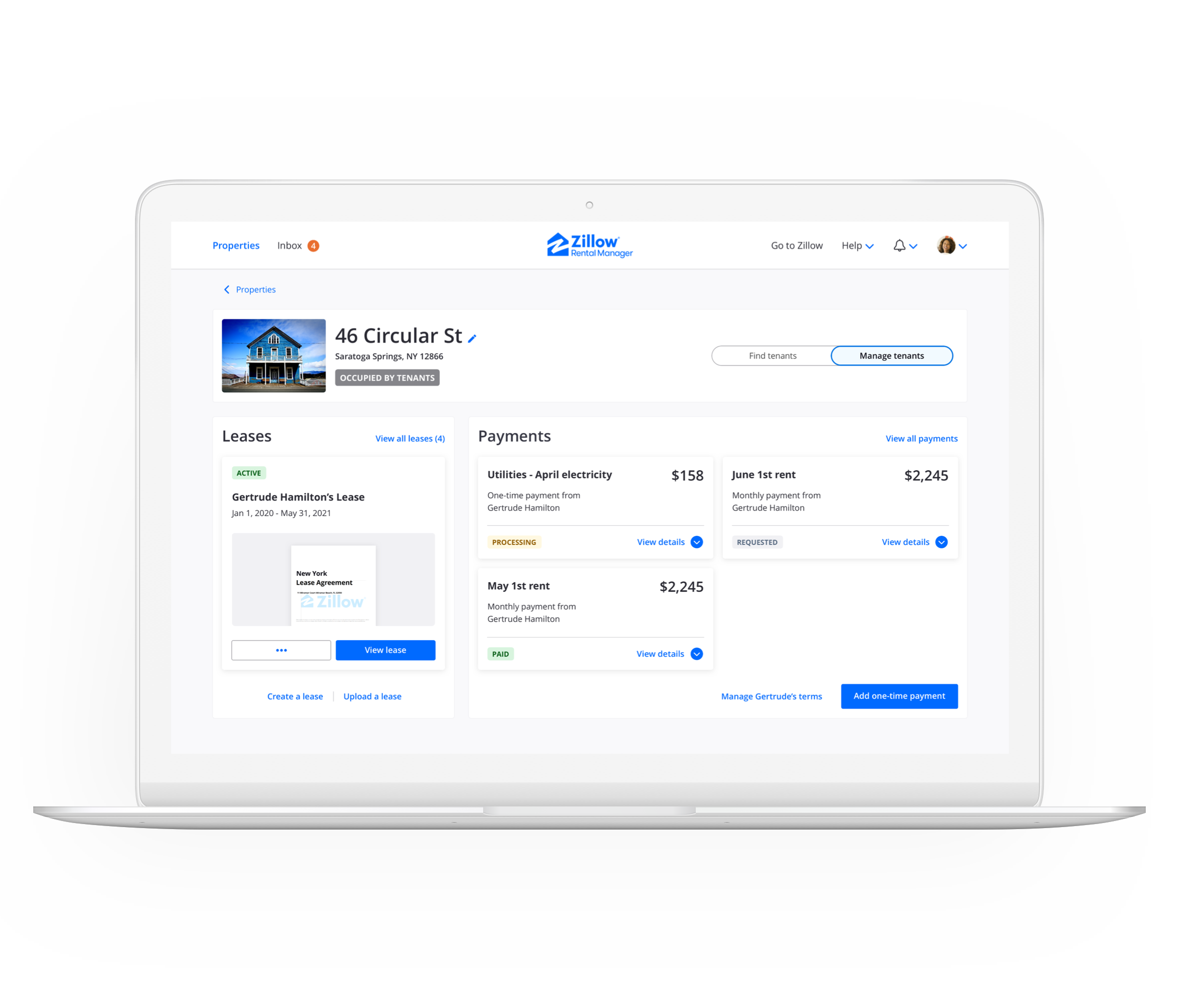
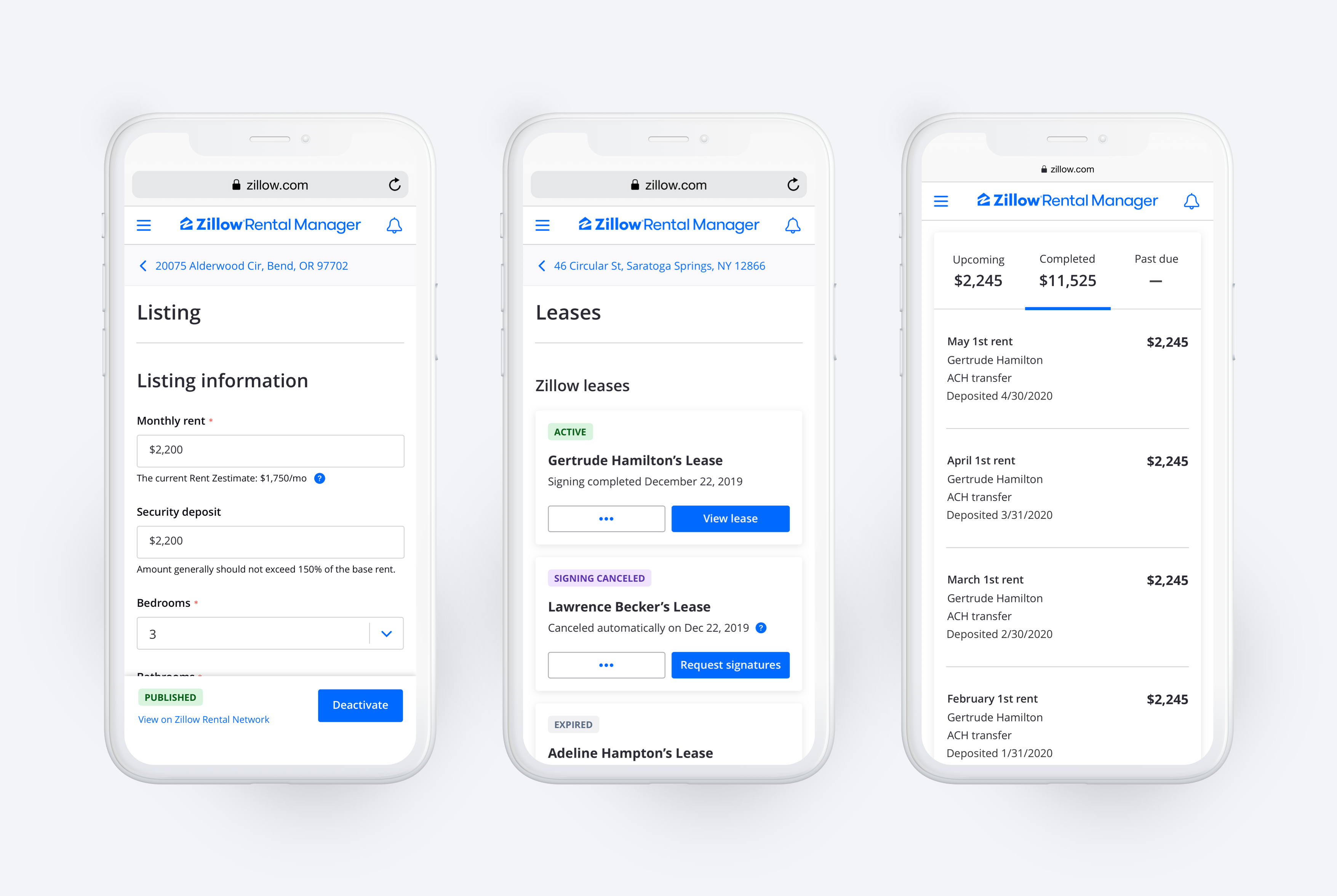
The leases shown in the Leases module pertain to either an upcoming or current tenant. This allows the landlord to know what to do next to get the lease signed and monitor the remaining time on it once the tenant has moved in. Prior to the redesign, the payments dashboard did not allow landlords to closely monitor the progress of payments. Now, the payments shown in this view are the upcoming and last completed payments so landlords have the insights they desire.
The leases shown in the Leases module pertain to either an upcoming or current tenant. This allows the landlord to know what to do next to get the lease signed and monitor the remaining time on it once the tenant has moved in. Prior to the redesign, the payments dashboard did not allow landlords to closely monitor the progress of payments. Now, the payments shown in this view are the upcoming and last completed payments so landlords have the insights they desire.
The leases shown in the Leases module pertain to either an upcoming or current tenant. This allows the landlord to know what to do next to get the lease signed and monitor the remaining time on it once the tenant has moved in. Prior to the redesign, the payments dashboard did not allow landlords to closely monitor the progress of payments. Now, the payments shown in this view are the upcoming and last completed payments so landlords have the insights they desire.
The leases shown in the Leases module pertain to either an upcoming or current tenant. This allows the landlord to know what to do next to get the lease signed and monitor the remaining time on it once the tenant has moved in. Prior to the redesign, the payments dashboard did not allow landlords to closely monitor the progress of payments. Now, the payments shown in this view are the upcoming and last completed payments so landlords have the insights they desire.
The System Amnesia and Unnecessary Steps usability problems are solved by focusing landlords on the most pertinent leases and payments and emphasizing next steps. Creating and signing leases and setting up payments will also have fewer steps if they are created for renters who have applied on the platform. In the future, the status of leases and payments can be used to bridge the Manage Tenants journey back to the Find Tenants journey.
The System Amnesia and Unnecessary Steps usability problems are solved by focusing landlords on the most pertinent leases and payments and emphasizing next steps. Creating and signing leases and setting up payments will also have fewer steps if they are created for renters who have applied on the platform. In the future, the status of leases and payments can be used to bridge the Manage Tenants journey back to the Find Tenants journey.
The System Amnesia and Unnecessary Steps usability problems are solved by focusing landlords on the most pertinent leases and payments and emphasizing next steps. Creating and signing leases and setting up payments will also have fewer steps if they are created for renters who have applied on the platform. In the future, the status of leases and payments can be used to bridge the Manage Tenants journey back to the Find Tenants journey.
The System Amnesia and Unnecessary Steps usability problems are solved by focusing landlords on the most pertinent leases and payments and emphasizing next steps. Creating and signing leases and setting up payments will also have fewer steps if they are created for renters who have applied on the platform. In the future, the status of leases and payments can be used to bridge the Manage Tenants journey back to the Find Tenants journey.
Tool detail views
Tool detail views
Tool detail views
Tool detail views
The tool detail views contain the content on the tabs in the old property page design. We refer to them as the listing form and the applications, leases, and payments dashboards. Before the redesign, landlords had to decipher for themselves which records were the most critical to them at any point in their journey and when to transition across tools. The redesigned platform uses these vertical list views to their strength as record keeping locations. I gave them a visual design refresh.
The tool detail views contain the content on the tabs in the old property page design. We refer to them as the listing form and the applications, leases, and payments dashboards. Before the redesign, landlords had to decipher for themselves which records were the most critical to them at any point in their journey and when to transition across tools. The redesigned platform uses these vertical list views to their strength as record keeping locations. I gave them a visual design refresh.
The tool detail views contain the content on the tabs in the old property page design. We refer to them as the listing form and the applications, leases, and payments dashboards. Before the redesign, landlords had to decipher for themselves which records were the most critical to them at any point in their journey and when to transition across tools. The redesigned platform uses these vertical list views to their strength as record keeping locations. I gave them a visual design refresh.
The tool detail views contain the content on the tabs in the old property page design. We refer to them as the listing form and the applications, leases, and payments dashboards. Before the redesign, landlords had to decipher for themselves which records were the most critical to them at any point in their journey and when to transition across tools. The redesigned platform uses these vertical list views to their strength as record keeping locations. I gave them a visual design refresh.
Inbox
Inbox
Inbox
Inbox
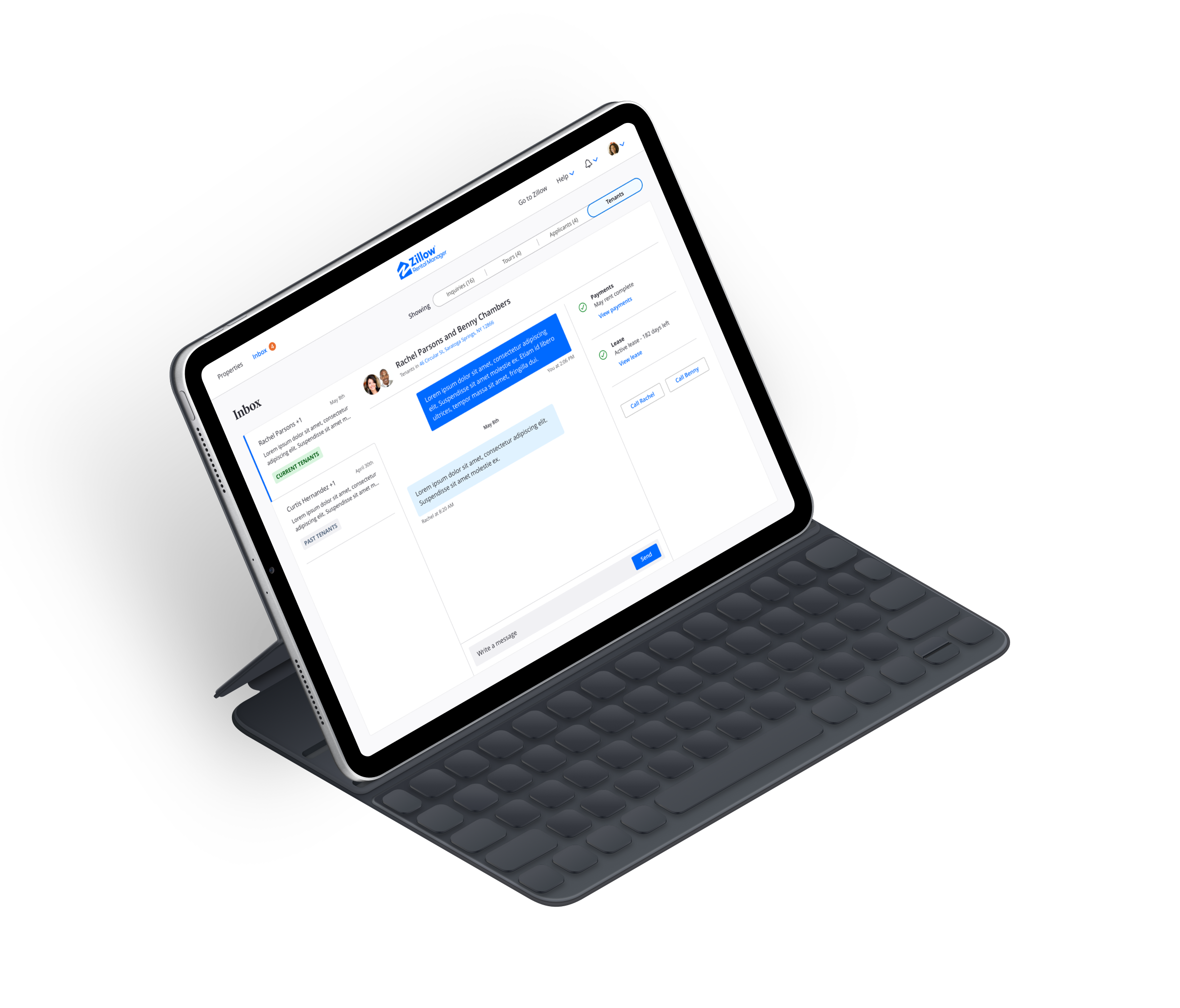
Inbox also had System Amnesia and Unnecessary Steps usability problems before the redesign. After completion of the concept phase, I handed this part of the project off to the lead designer for Inbox. Shown here are my concept designs - not the final designs.
Inbox also had System Amnesia and Unnecessary Steps usability problems before the redesign. After completion of the concept phase, I handed this part of the project off to the lead designer for Inbox. Shown here are my concept designs - not the final designs.
Inbox also had System Amnesia and Unnecessary Steps usability problems before the redesign. After completion of the concept phase, I handed this part of the project off to the lead designer for Inbox. Shown here are my concept designs - not the final designs.
Inbox also had System Amnesia and Unnecessary Steps usability problems before the redesign. After completion of the concept phase, I handed this part of the project off to the lead designer for Inbox. Shown here are my concept designs - not the final designs.
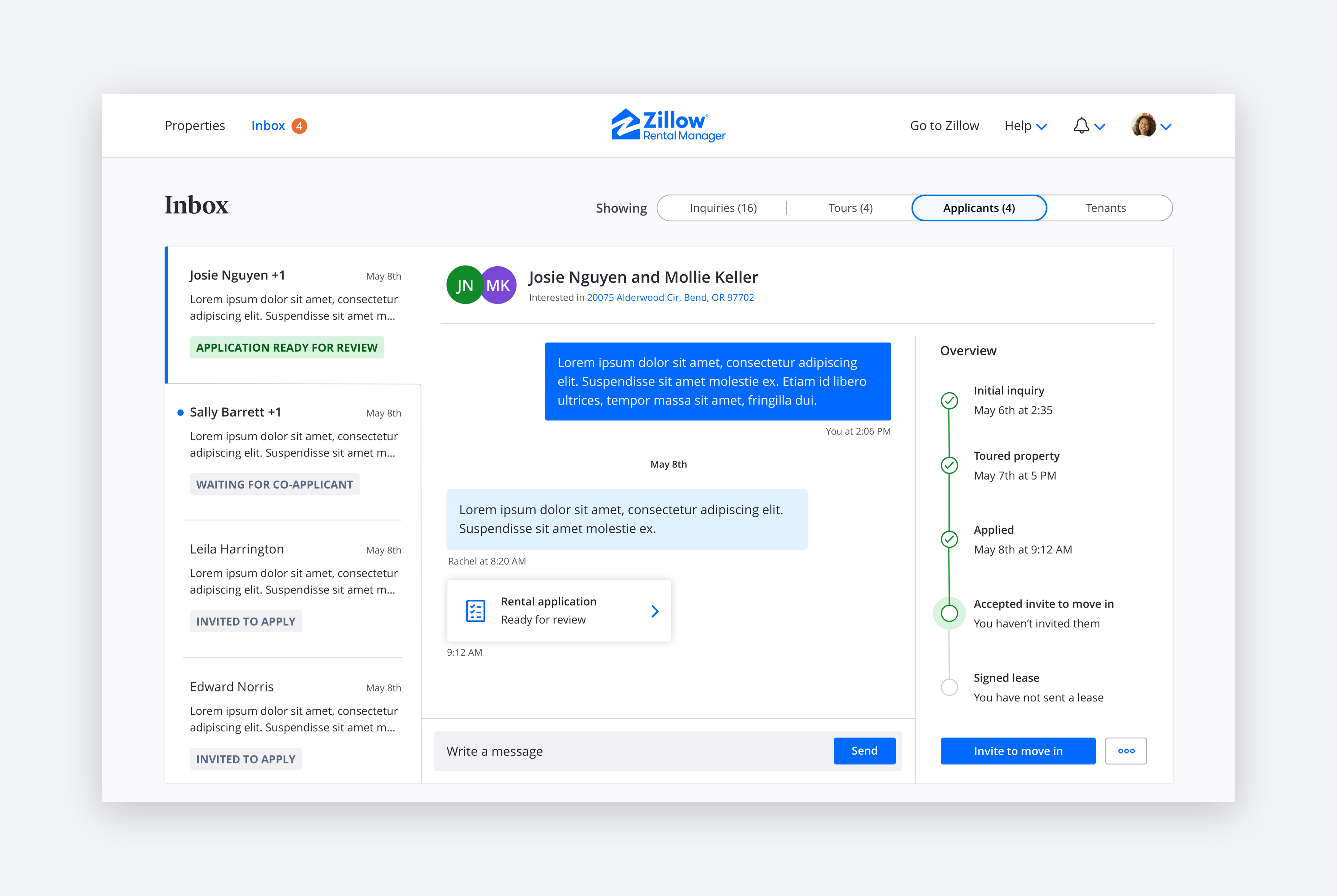
The list of conversations gives landlords an overview of communication with potential renters and tenants. Each one is labeled with a status that indicates progress in the tenant-finding journey. Each conversation is paired with a suggested next step. Examples of this are inviting the renter to move in once they have submitted their application and starting a lease once they have acknowledged that they would like to move in. This enables the landlord to easily understand what they should do next to stay on track using the platform tools. Landlords can also view artifacts such as applications and leases from the conversation. This is so they don’t have to leave the the conversation and navigate to the property before taking the next step with that renter.
The list of conversations gives landlords an overview of communication with potential renters and tenants. Each one is labeled with a status that indicates progress in the tenant-finding journey. Each conversation is paired with a suggested next step. Examples of this are inviting the renter to move in once they have submitted their application and starting a lease once they have acknowledged that they would like to move in. This enables the landlord to easily understand what they should do next to stay on track using the platform tools. Landlords can also view artifacts such as applications and leases from the conversation. This is so they don’t have to leave the the conversation and navigate to the property before taking the next step with that renter.
The list of conversations gives landlords an overview of communication with potential renters and tenants. Each one is labeled with a status that indicates progress in the tenant-finding journey. Each conversation is paired with a suggested next step. Examples of this are inviting the renter to move in once they have submitted their application and starting a lease once they have acknowledged that they would like to move in. This enables the landlord to easily understand what they should do next to stay on track using the platform tools. Landlords can also view artifacts such as applications and leases from the conversation. This is so they don’t have to leave the the conversation and navigate to the property before taking the next step with that renter.
The list of conversations gives landlords an overview of communication with potential renters and tenants. Each one is labeled with a status that indicates progress in the tenant-finding journey. Each conversation is paired with a suggested next step. Examples of this are inviting the renter to move in once they have submitted their application and starting a lease once they have acknowledged that they would like to move in. This enables the landlord to easily understand what they should do next to stay on track using the platform tools. Landlords can also view artifacts such as applications and leases from the conversation. This is so they don’t have to leave the the conversation and navigate to the property before taking the next step with that renter.
Outcome
Outcome
Outcome
Outcome
This project was handed off for development in June of 2020 and is in the process of being built. I have presented my designs to the leadership of Zillow Group Rentals. They, along with the individual product teams for listing, inbox, applications, leases, and payments are very excited to ship this. We believe this redesign will increase user satisfaction with the platform. The organization has an objective to increase the number of landlords who use all platform tools. I am certain the usability problems will no longer stand in the way. I will update this case study with results once the project launches.
This project was handed off for development in June of 2020 and is in the process of being built. I have presented my designs to the leadership of Zillow Group Rentals. They, along with the individual product teams for listing, inbox, applications, leases, and payments are very excited to ship this. We believe this redesign will increase user satisfaction with the platform. The organization has an objective to increase the number of landlords who use all platform tools. I am certain the usability problems will no longer stand in the way. I will update this case study with results once the project launches.
This project was handed off for development in June of 2020 and is in the process of being built. I have presented my designs to the leadership of Zillow Group Rentals. They, along with the individual product teams for listing, inbox, applications, leases, and payments are very excited to ship this. We believe this redesign will increase user satisfaction with the platform. The organization has an objective to increase the number of landlords who use all platform tools. I am certain the usability problems will no longer stand in the way. I will update this case study with results once the project launches.
This project was handed off for development in June of 2020 and is in the process of being built. I have presented my designs to the leadership of Zillow Group Rentals. They, along with the individual product teams for listing, inbox, applications, leases, and payments are very excited to ship this. We believe this redesign will increase user satisfaction with the platform. The organization has an objective to increase the number of landlords who use all platform tools. I am certain the usability problems will no longer stand in the way. I will update this case study with results once the project launches.
Lessons learned
Lessons learned
Lessons learned
Lessons learned
01
01
01
01
Zillow Group’s product organization historically had its teams operate in silos. For example, the leases team would design and build the leases product independent of the listing, applications, and payments teams. This approach allows for the speed of a startup company but makes for a very disjointed user experience. This project was needed in order to fix this disjointedness. I am proud of the work we have done. The usability problems could have been prevented had we used this collaborative process from the beginning. I have made product leaders in the organization aware of that and we are launching more initiatives across teams as a result.
Zillow Group’s product organization historically had its teams operate in silos. For example, the leases team would design and build the leases product independent of the listing, applications, and payments teams. This approach allows for the speed of a startup company but makes for a very disjointed user experience. This project was needed in order to fix this disjointedness. I am proud of the work we have done. The usability problems could have been prevented had we used this collaborative process from the beginning. I have made product leaders in the organization aware of that and we are launching more initiatives across teams as a result.
Zillow Group’s product organization historically had its teams operate in silos. For example, the leases team would design and build the leases product independent of the listing, applications, and payments teams. This approach allows for the speed of a startup company but makes for a very disjointed user experience. This project was needed in order to fix this disjointedness. I am proud of the work we have done. The usability problems could have been prevented had we used this collaborative process from the beginning. I have made product leaders in the organization aware of that and we are launching more initiatives across teams as a result.
Zillow Group’s product organization historically had its teams operate in silos. For example, the leases team would design and build the leases product independent of the listing, applications, and payments teams. This approach allows for the speed of a startup company but makes for a very disjointed user experience. This project was needed in order to fix this disjointedness. I am proud of the work we have done. The usability problems could have been prevented had we used this collaborative process from the beginning. I have made product leaders in the organization aware of that and we are launching more initiatives across teams as a result.
02
02
02
02
I learned important insights about the planning and facilitating of co-creation workshops. We allowed for insufficient time for ideation with the landlords. In the future, I will make sure we budget for more time and move on to ideation when needed. Additionally, we can use other methods for collecting foundational insights about user journeys and should make sure co-creation focuses on ideation. I would like to have participants explain their desired solutions while I visualize them by sketching on paper. I am looking forward to trying this method again.
I learned important insights about the planning and facilitating of co-creation workshops. We allowed for insufficient time for ideation with the landlords. In the future, I will make sure we budget for more time and move on to ideation when needed. Additionally, we can use other methods for collecting foundational insights about user journeys and should make sure co-creation focuses on ideation. I would like to have participants explain their desired solutions while I visualize them by sketching on paper. I am looking forward to trying this method again.
I learned important insights about the planning and facilitating of co-creation workshops. We allowed for insufficient time for ideation with the landlords. In the future, I will make sure we budget for more time and move on to ideation when needed. Additionally, we can use other methods for collecting foundational insights about user journeys and should make sure co-creation focuses on ideation. I would like to have participants explain their desired solutions while I visualize them by sketching on paper. I am looking forward to trying this method again.
I learned important insights about the planning and facilitating of co-creation workshops. We allowed for insufficient time for ideation with the landlords. In the future, I will make sure we budget for more time and move on to ideation when needed. Additionally, we can use other methods for collecting foundational insights about user journeys and should make sure co-creation focuses on ideation. I would like to have participants explain their desired solutions while I visualize them by sketching on paper. I am looking forward to trying this method again.
Henrik Holm Christensen
Aarhus, Denmark
Phone
